Sunday, August 29, 2010

Some Useful Properties of Binding Class

When binding the UI control with the data source the Binding class has some useful properties.In this post we will look at them and use them in sample application. The properties which we are going to discuss in this post are the FallbackValue ,TargetNullValue, and StringFormat. Image 1 shows the output of the example code.
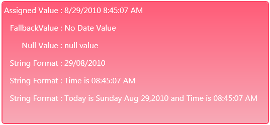
Image 1

Let us discuss each of the property in detail here.

FallbackValue:
                   The first property which we are discussing here is the FallbackValue which is used to Gets or sets the value to use when the binding is unable to return a value.If the path of the property which is bind to the UI control is not found then the DependencyProperty.UnsetValue is returned, then the target property is set to the FallbackValue. if you have set one for the UI element. In Image 1 I have set the FallbackValue for the set statement in the output. The syntax of the setting the FallbackValue is

<TextBlock Text="{Binding UnassignedDateValue,FallbackValue='No Date Value'}" Foreground="White" FontSize="16" FontFamily="Segoe UI"/>

List 1
In the above statement I have remove the grid column and row and also the vertical and horizontal alignment of the text block control. In my case I have not such property with the name UnassignedDateValue in my source so the binding fail and the FallbackValue is displayed as you can see in the Image 1.

TargetNullValue :
                          The second property which is very useful when binding the UI element is the TargetNullValue which is set when the source is null. Tye syntax of  setting the target null value is as given in List 2.

<TextBlock Text="{Binding NullDateValue,TargetNullValue='null Value'}" Foreground="White" FontSize="16" FontFamily="Segoe UI"/>
List 2

Here I have bind the text block text property with the NullDateValue which of nullable DateTime type and I have not set the value of the this, mean default value will be null and the value of the TargetNullValue will be displayed on the screen. This property is very useful when you want to set the null value for a property in code behind now you can set the null value of a property in the UI side.

StringFormat:
                       The third and last useful binding property is the string format property which is very hand if you don't want to set the formatting of the property in code behind. So no need to write the converter for the formatting of the output. Just use the StringFormat property of the binding class.In the List 3, I have used the possible format for the date time, there are scenario when you need to show on the date i.e to show the date of birth, and only the time, and also use the custom format to display string.

<TextBlock Text="{Binding AssignedDateValue,StringFormat='dd/MM/yyyy'}" Foreground="White" FontSize="16" FontFamily="Segoe UI"/> <TextBlock Text="{Binding AssignedDateValue,StringFormat='Time is {0:HH:mm:ss tt}'}" Foreground="White" FontSize="16" FontFamily="Segoe UI"/> <TextBlock Text="{Binding AssignedDateValue,StringFormat='Today is : {0:dddd MMM dd,yyyy} and Time is {0:HH:mm:ss tt}'}" Foreground="White" FontSize="16" FontFamily="Segoe UI"/>
List 3
In the Image 1 last three output statement show the result.In List 3, the first statement is used to display the date part of the dateTime and in the second statement it only show the time part of the date time and then in the last statement , the date and time are shown but with the string value as well for property formatting. Hope you get some idea of these three useful properties, use them in your UI if your bind property have one of above possible value.

All and any comments / bugs / suggestions are welcomed!


Saturday, August 28, 2010

Reading Harddisk Information Using Silverlight 4 Out Of Browser Application

To read the hard disk information in silverlight was my question which I have search on net and was keen to do that, because I want to learn the silverlight. So after search on internet and searching the msdn for this question here is what I have found. You can see the out of the sample code in the Image 1, Here in the Image 1 I have display the hard disk partition just like the window 7 , the title , the progress bar to indicate the usage of the partition space and the at the end the summary of the the partition size.

Image 1

Now let us start with the code sample. First you have to create silverlight out of browser application for this you can click here to read how to create an out of browser application. From the link you can learn how to create an out of browser application in detail.Below is my code which is used to get the drive information. Here you can see that I have called the AutomationFactory.CreateObject, and passing the progID to the CreateObject.The AutomationFactory Provides access to registered Automation servers.Automation is a Windows-based technology that applications use to expose functionality to scripting tools and other applications. For example, you can use Automation to add Office features to your Silverlight-based applications.
An application or component exposing functionality is called an Automation server; an application accessing the functionality is called an Automation client. Because Automation servers must be preinstalled and run in full trust, Silverlight enables only trusted applications to serve as Automation clients.

dynamic fileSystem = AutomationFactory.CreateObject("Scripting.FileSystemObject"); dynamic drives = fileSystem.Drives; DriveInformationCollection = new List&lg;DriveInformation>(); foreach (var drive in drives) { try { if (drive.IsReady) DriveInformationCollection.Add(new DriveInformation { VolumeName = drive.VolumeName, DriveLetter = drive.DriveLetter, TotalSpace = drive.TotalSize, FreeSpace = drive.FreeSpace, FileSystem = drive.FileSystem, DriveType = (eDriveType)Enum.ToObject(typeof(eDriveType), drive.DriveType) }); } catch (COMException Ex) { string strMessage = Ex.Message; } }

Now we have the reference of the automation server which is store in fileSystem of type dynamic.Dynamic is a new type provided by framework 4, you can get more information about the dynamic type by clicking here. Next I have call the drives object of the fileSystem to store the drive in new dynamic object. And then I have used to foreach loop to get the drive information to be store in the class which I have created with the name DriveInformation name.The Drive object allows you to gain information about the various drives attached to a system, either physically or over a network. Its properties allow you to obtain information about:
  • The total size of the drive in bytes (TotalSize property)
  • How much space is available on the drive in bytes (AvailableSpace or FreeSpace properties)
  • What letter is assigned to the drive (DriveLetter property)
  • What type of drive it is, such as removable, fixed, network, CD-ROM, or RAM disk (DriveType property)
  • The drive's serial number (SerialNumber property)
  • The type of file system the drive uses, such as FAT, FAT32, NTFS, and so forth (FileSystem property)
  • Whether a drive is available for use (IsReady property)
  • The name of the share and/or volume (ShareName and VolumeName properties)
  • The path or root folder of the drive (Path and RootFolder properties)
In the view of the form. I have used the list box control to display the drive information , which consist of the text block and the progress bar control.For progress bar control I have added two ChangePropertyAction which you can here for more detail. The condition for first ChangePropertyAction is to check the value of the progress bar if the value is greater then or equal to 80 then the progress bar will be shown red and if the value of the progress bar is less then 80 then progress bar will be shown normally. And the bottom of the user control I have used the grid layout control, the data context of the grid control is set to the selected Item of the list box control. When the selection of the list box changed the correspondent detail of the selected item will be displayed at the bottom of the user control.You can download the source code from here

References 

1- Automation Class
2- Working with Drives and Folders


All and any comments / bugs / suggestions are welcomed!

Tuesday, August 24, 2010

Binding ListView Control Using MVVM

In this short post I will show you how you can bind the list view control and get the selected value of the list view control using MVVM pattern. For this post I have added one list view control which hold the grid view control in it view and when item is selected in the grid view the selected item is shown at the end of the screen. In the Image 1the selected items are not shown ( only the label fields are shown) but in the Image 2 when user click on any of the item the detail is shown.

Image 1

Here you can see the first name and last name are concatenated to make the full name, email address, contact number and the date of birth of the selected person is shown.
Image 2

Model:
            In the model folder I have one file with the name MainWindowModel which has one class with the name of the Persons. The Persons class has the UserID, first name, last name, EmailID , contact number and the date of birth properties.

ViewModel:
                    In the viewModel folder I have one file with the name MainWindowViewModel which contain class of same name. The viewModel has two properties one is the PersonRecords ( which is list of Person records used to bind with the list view control) and the second one is the SelectedPersonRecord( which is of type Person and used to bind with the selected value of the list view control.which holds the selected value of the list view control).

View:
         In the view , I have list view control which is bind to the PersonRecords ( the ItemSource of the list view control) and the SelectedItem of the list view control is bind to the SelectedPersonRecord as you can see in the code below and the binding mode of the SelectedItem is two way as I want to send back the latest changes to the viewModel as well.

< ListView ItemsSource="{Binding PersonRecords}" Margin="5" AlternationCount="1" Grid.Row="1" SelectedItem="{Binding SelectedPersonRecord, Mode=TwoWay}"> < ListView.View > < GridView > < GridViewColumn Header="First Name" DisplayMemberBinding="{Binding FirstName}"/> < GridViewColumn Header="Last Name" DisplayMemberBinding="{Binding LastName}"/> < GridViewColumn Header="Email Address" DisplayMemberBinding="{Binding EmailID}"/> < GridViewColumn Header="Contact Number" DisplayMemberBinding="{Binding ContactNumber}"/> < GridViewColumn Header="Date Of Birth" DisplayMemberBinding="{Binding DateOfBirth, Converter={StaticResource showOnlyDate}}"/> < /GridView> < /ListView.View> < /ListView> < Button Grid.Row="2" Content="Close" Width="70" Height="24" HorizontalAlignment="Right" d:LayoutOverrides="Width" Margin="0,0,5,0" Command="ApplicationCommands.Close" /> < TextBlock Grid.Row="3" HorizontalAlignment="Left" Text="Selected Item Values" FontWeight="ExtraBold"/> < TextBlock Grid.Row="4" HorizontalAlignment="Left" DataContext="{Binding SelectedPersonRecord}"> < Run Text="Name : " FontWeight="Bold"/> < Run Text="{Binding LastName}"/> < Run Text=","/> < Run Text="{Binding FirstName}"/> < Run Text="Email Address : " FontWeight="Bold"/> < Run Text="{Binding EmailID}"/> < /TextBlock> < TextBlock Grid.Row="5" DataContext="{Binding SelectedPersonRecord}" HorizontalAlignment="Left"> < Run Text="Contact Number: " FontWeight="Bold"/> < Run Text="{Binding ContactNumber}"/> < Run Text="Date Of Birth : " FontWeight="Bold"/> < Run Text="{Binding DateOfBirth,StringFormat='dd/MM/yyyy'}"/> < /TextBlock>

When user click on any  of the item in the list view the corresponded value is shown at the bottom of the form. which has dataContaxt of SelectedRecord. I have set the dataContext of each of the textblock control to the SelectedPersonRecord property and then use the Run object of the Textblock control to format and bind to the properties like first name, last name, emailID, contact number and date of birth.You can download the source code from here

All and any comments / bugs / suggestions are welcomed!

Sunday, August 22, 2010

DataGrid RowDetailsTemplate of WPF 4.0

In this post I will show you how you can use the RowDetailsTemplate of the datagrid control to show the additional information of the record. Let us start with the code. I will continue my last post where I have introduce some of the basic information about the data grid control. Here I will add the RowDetailsTemplate of the data grid control and also add some values to show the detail of the row when the row is clicked by mouse. Below are the screen shot of the example code In image 1 data grid control is showing normally and In Image 2, the detail of the row is visible when user click on the row of  the data grid control.

Image 1


Image 2
Below is the my xaml code which is used to create the RowDetailsTemplates. Here you can see that the you can add the DataTemplate in the RowDetailsTemplate. In the data template you can define your own layout for the detail to be shown when user click on the row of the datagrid control.

<DataGrid Name="dgrdDataGrid" AutoGenerateColumns="False" > <DataGrid.Columns> <DataGridTextColumn Binding="{Binding FirstName}" Header="First Name" CanUserSort="False" /> <DataGridTextColumn Binding="{Binding LastName}" Header="Last Name" CanUserResize="False"/> <DataGridTextColumn Binding="{Binding EmailID}" Header="Email Address" CanUserReorder="False"/> <DataGridTextColumn Binding="{Binding ContactNumber}" Header="Contact Number"/> <DataGridTextColumn Binding="{Binding DateOfBirth, StringFormat='dd/MM/yyyy'}" Header="Date Of Birth"/> </DataGrid.Columns> <DataGrid.RowDetailsTemplate> <DataTemplate > <Grid Height="90"> <Grid.RowDefinitions> <RowDefinition Height="1*"/> <RowDefinition Height="25"/> <RowDefinition Height="25"/> <RowDefinition Height="1*"/> </Grid.RowDefinitions> <Grid.ColumnDefinitions> <ColumnDefinition Width="80"/> <ColumnDefinition/> <ColumnDefinition Width="80"/> <ColumnDefinition/> </Grid.ColumnDefinitions> <Border Grid.RowSpan="4" Grid.ColumnSpan="4" Background="#FFD2EBFF" BorderBrush="#FF79C4FF" CornerRadius="3" BorderThickness="2,2,2,2" Margin="2"/> <TextBlock Text="Name:" Grid.Column="0" Grid.Row="1" VerticalAlignment="Center" HorizontalAlignment="Right" /> <TextBlock Grid.Column="1" Grid.Row="1" VerticalAlignment="Center" Margin="2"> <Run Text="{Binding LastName}"/> <Run Text=", "/> <Run Text="{Binding FirstName}"/> </TextBlock> <TextBlock Text="Contact No.:" Grid.Column="2" Grid.Row="1" VerticalAlignment="Center" HorizontalAlignment="Right" /> <TextBlock Text="{Binding ContactNumber}" Grid.Column="3" Grid.Row="1" VerticalAlignment="Center" /> <TextBlock Text="Email Address:" Grid.Column="0" Grid.Row="2" VerticalAlignment="Center" HorizontalAlignment="Right" /> <TextBlock Text="{Binding EmailID}" Grid.Column="1" Grid.Row="2" VerticalAlignment="Center" Margin="2"/> <TextBlock Text="Date Of Birth:" Grid.Column="2" Grid.Row="2" VerticalAlignment="Center" HorizontalAlignment="Right" /> <TextBlock Text="{Binding DateOfBirth, StringFormat='dd MMM, yyyy'}" Grid.Column="3" Grid.Row="2" VerticalAlignment="Center" Margin="2"/> </Grid> </DataTemplate> </DataGrid.RowDetailsTemplate> </DataGrid>

When working with the RowDetailTemplate there are certain properties and events which you may need at certain level. The RowDetailsVisibilityMode is used for the detail of the row to be showed. Collapsed( The row details section is not displayed for any rows),Visible (The row details section is displayed for all rows), VisibleWhenSelected (The row details section is displayed only for selected rows) are the constant value for the RowDetailsVisibilityMode property. The default value for the RowDetailsVisibilityMode property is VisibleWhenSelected. when the visibility of a row details element changes then RowDetailsVisibilityChangede event is fired which you can handler for you needs.You can download the source code from here

All and any comments / bugs / suggestions are welcomed!

WPF 4.0 Datagrid Control Basic Information

In this post I will use the data grid control which is part of the WPF 4 and try to highlight the basic functionality of the data grid control. Let us start with the example code, below is the screen shot of the application. I have only one control on my window form which is the data grid control and the data grid control is bind from the code behind ( when the window form is loaded the data grid control Items source is assigned the value of the list of person Records).

Image 1

The data grid control is very useful control to display the information to the end user. The information is arranged in the tabular format. The default functionality which is offered by the data grid control is the sorting, reordering and resizing of the data grid control column. The reordering of the column is that when you click on one column and place it before the another column then it will be placed there, you can arranged them as you like, mean in the Image 1 you can see that first name is placed before last name but if you want to see the last name first then you can place the last name before the first name ( as you can see in the Image 2). The reordering of the column take place at run time not at compile time.

Image 2

You can also disabled the functionality of the sort, resize and reoder of the the columns of the data grid control by using assigning the false value to the following properties CanUserSortColumns  (Gets or sets a value that indicates whether the user can sort columns by clicking the column header) ,CanUserReorderColumns (Gets or sets a value that indicates whether the user can change the column display order by dragging column headers with the mouse),CanUserResizeColumns (Gets or sets a value that indicates whether the user can adjust the width of columns by using the mouse) for sorting, reordering and resizing respectivly. If you look at the DataGridColumn class it has the column level CanUserSort, CanUserReorder and CanUserResize properties which can be set at column level. If you don't want to user to sort the first name column but all the remain columns can be sortable then you can set the CanUserSort property of the first name column to false, now user can't sort the first name column but all the other columns can be sortable.Same is the case for CanUserReorder and CanUserResize property. I have set the CanUserSort property of first name column,  CanUserResize property of the last name column and CanUserReorder property of the email address column to false.

Note: If the DataGridColumn.CanUserSort property and the DataGrid.CanUserSortColumns property are both set, a value of false takes precedence over a value of true.

DataGrid Columns Type: Below is the list of the columns type which are supported by the data grid control.

DataGridTextColumn: Perfect for strings, this column type displays a TextBlock for its normal display and a TextBox when the value is being edited.

DataGridHyperlinkColumn: Turns what would be plain text into a clickable hyperlink. However, note that there is no default behavior associated with clicking that link (such as opening a web browser). You must explicitly handle such actions.

DataGridCheckBoxColumn:Perfect for Boolean values, this column type CheckBox to represent a true (checked) or false (unchecked) value.

DataGridComboBoxColumn: Perfect for enumerations, this column type displays a TextBlock for its normal display and a ComboBox filled with possible values when the value is being edited.

DataGridTemplateColumn: Enables an arbitrary template to be set for a value’s normal display as well as its editing display. This is done by setting its CellTemplate and CellEditingTemplate properties.

Auto-Generated Columns: The auto generated columns property is useful if you don't want to set the columns.When you drag and drop the data grid control the the, if you look at the xaml which is generated for the data grid control then you can see the AutoGenderateColumns property is set to false by default.When  you set the AutoGenerateColumns of the data grid to true then DataGridTextColumn is automatically used for strings, DataGridHyperlinkColumn is automatically used for URIs, DataGridCheckBoxColumn is automatically used for Booleans, and DataGridComboBoxColumn is automatically used for enumerations (with an appropriate items source hooked up automatically). When you set the AutoGenerateColumns of the data grid to true the header text will be the name of the properties, FirstName , LastName etc are the Properties name. As you can see in the Image 3. By setting the AutoGenerateColumns all the columns in the data source are displayed.

Image 3

If a DataGrid already has explicit columns defined, any autogenerated columns are placed after them. You can customize or remove individual autogenerated columns by handling the AutoGeneratingColumn event, which is raised once for each column. When all the columns have been generated, a single AutoGeneratedColumns event is raised. To disable autogenerated columns altogether, simply set DataGrid’s AutoGenerateColumns property to false.

All and any comments / bugs / suggestions are welcomed!


Friday, August 20, 2010

WPF TextBlock Inline Property

Another useful property of the text block control of the WPF is the inline property which is used to Gets an InlineCollection containing the top-level Inline elements that comprise the contents of the TextBlock.A Run is simply a chunk of text with identical formatting. Using a single explicit Run doesn’t add value, but things can start to get interesting when you use multiple Runs in the same TextBlock.
Below is the xaml code which is written  and the output of the below code can be seen in the Image 1. In the code snipped for the first text block control I have used simple inline static text to assigned to the text property of the run object. And also set the font style, font weight, foreground color, font size of the run object.So that the each text in single text block control appear differently and you can see this in the Image 1( the first line of the output).

<TextBlock VerticalAlignment="Top" Margin="5,2,0,0" HorizontalAlignment="Left" FontSize="12" > <Run Text="Shane," FontStyle="Italic"/> <Run Text="Bond" FontWeight="Bold" Foreground="Red" FontSize="14"/> <Run Text="(Mr.)"/> </TextBlock > <TextBlock VerticalAlignment="Top" Margin="5,2,0,0" HorizontalAlignment="Left" FontSize="12" > <Run Text="{Binding FirstName}" FontStyle="Italic"/> <Run Text="{Binding LastName}" FontWeight="Bold" Foreground="Red" FontSize="14"/> <Run Text="{Binding Title}" /> </TextBlock > <TextBlock VerticalAlignment="Top" Margin="5,2,0,0" HorizontalAlignment="Left" FontSize="12" > <Run FontStyle="Italic"> Shane, </Run> <Run FontWeight="Bold" Foreground="Red" FontSize="14"> Bond </Run> <Run>(Mr.)</Run> </TextBlock >

The Text property of the Run object is a dependency property, which means that you can bind the Text property to a data source. The Text property fully supports one-way binding in FlowDocumentReader and other controls that display read-only text. For more information about data binding. In the code snipped above I have bind the text property of the run object to the data source. The output of the second text block control can be seen in the Image 1 (second line in the output).

Image 1

The last one is the use of the run object without using the text property of the run object. Here you can see that same static text is assigned to the run object as in case of the first text block control. But one important thing is that in the second run object the Bond string is assign to the run object with lot of leading and trailing whitespace is place but the output of the third text block control is same as the output of the first text block control.

Note: When a TextBlock’s content is set via the Text property, any whitespace in the string is preserved. When its content is set via Inlines in XAML, however, whitespace is not preserved. Instead, leading and trailing whitespace is ignored.

Hope you get some idea of how to use the run object and also how to set the property of the individual run object.

All and any comments / bugs / suggestions are welcomed!


Thursday, August 19, 2010

WPF TextBlock Control TextTrimming Property

The TextBlock control of the WPF is very useful control and is used in every application we have develop or are developing as we have to show some constant value to user, suppose you are designing the user input form and you have to ask certain information to user. The static text like First name, last name, email address , contact number etc are static static and you can use the Text box , so that user can enter information, There are situations where you have to show data to the end user , like this there are many situation when you need to show data to the user.And text block control is used to show data to the end user. In this post we are going to see the important property of the text block control which is very handy and useful. The TextTrimming property of the the text block control.TextTrimming property Gets or sets the text trimming behavior to employ when content overflows the content area. The TextTrimming propery offer following three options when you use the TextTrimming property in you xaml or in your code.
1- TextTrimming.None
                      The enumeration of the TextTrimming property is the TextTrimming.None. Which is the default value of the TextTrimming property , mean if you don't use the TextTrimming property in you code or xaml then the default value TextTrimming.None is used. Which mean the text will be not trimmed, which you can see in the Image 1, In the image 1 the first line show the text of the text block of TextTrimming.None option.Here you can see  text is simply cropped to the boundary of the parent text container.

2- TextTrimming.CharacterEllipsis:
         When data is shown to user in the tabular format like that data grid control, the column size are usual fixed, So if the column has more text then the allocated size then it is nice to show ellipsis(...) at the end of the text so that user can see that there is some more text. The TextTrimming.CharacterEllipsis is used to do exactly the same job for you. The CharacterEllipsis trimmed text at a character boundary. An ellipsis (...) is drawn in place of remaining text. So you don't need to write code to show the ellipsis at the end of the text value, just used the CharacterEllipsis

3- TextTrimming.WordEllipsis:
                                  The TextTrimming.WordEllipsis is the third option of the TextTrimming property.When TextTrimming is set to WordEllipsis, text is trimmed and continued with an ellipsis at the end of the first full word closest to the trimming edge. This setting will not show partially trimmed words, but tends not to trim text as closely to the trimming edge as the CharacterEllipsis setting.

Sample code for the use of the above three option is given below. Here you can see that I have used it in the xaml, you can also specify it in the code behid or your favorite programming language such as C# or vb.net.

< TextBlock VerticalAlignment="Top" Margin="5,2,0,0" TextTrimming="None" Width="155" HorizontalAlignment="Left" FontSize="20" Text="Shane, Bond (Mr.)" /> < TextBlock VerticalAlignment="Top" Margin="5,2,0,0" TextTrimming="CharacterEllipsis" Width="155" HorizontalAlignment="Left" FontSize="20" Text="Shane, Bond (Mr.)" /> < TextBlock VerticalAlignment="Top" Margin="5,2,0,0" TextTrimming="WordEllipsis" Width="155" HorizontalAlignment="Left" FontSize="20" Text="Shane, Bond (Mr.)" />

And here is the output of the above code here you can see that when the option None is selected then the text is not trimmed as you can see the first line of the output. But when the CharacterEllipsis is used Text is trimmed at a character boundary, which is shown in the second line of the output. And at the end I have used the last option which is the WordEllipsis Text is trimmed at a word boundary, as you can see the third line line of the output screen.

Image 1

TextTrimming is nice property by the text block control, as there are situation when we need to write code to cute the length of the text shown in the grid or in some user interface.So now if you are using WPF then you don't need to write code to cute the text from the end of the text just use the TextTrimming property and use the option which fulfill your needs.

All and any comments / bugs / suggestions are welcomed!
 

Monday, August 16, 2010

ChangePropertyAction Behavior For Beginners

In this post I will show you how you can use the ChangePropertyAction behavior of the silverlight 4. The ChangePropertyAction is used to change the property of the control You can use the ChangePropertyAction behavior to easily either change or increment the property of an object and then, optionally, define a transition. By default, the transition is instantaneous.(Source). Now let us start our example. Below is the my main screen which consist of 2 slider control, one progress bar and two text block control. The first slider control  which is used to set the style change limit for the second progress bar control, is also bind with the text block which is next to the that slider control, the text block will show the value or you can say the style change limit , the default will be 55 which I have set for the first slider control, The first slider control value is also bind with the ChangePropertyAction behavior which I will discuss later in this post.
Image 1
Next is another slider control which is used to change the Progress bar value and the value of the second slider control is also bind with the ChangePropertyAction behavior and I also with the value of the progress bar value, the last control which is the progress bar control is used to style of the progress bar depending on the value of the first slider control and the comparing it with the second slider control value. These are the functionality and control used in this example. Now lets us start the code which is used in this source code.

How to Add the ChangePropertyAction:
To add the changePropertyAction to your control you just need to drag the ChangePropertyAction from behavior to the control to which you want to change the property. Open the project in expression blend and click on the Assets panel and then click on the behaviors and you will see number of build-in behavior which are provided. Now select the ChangePropertyAction behavior and drop it on the progress bar control as I want to change the style property of the progress bar to be change to the different style. 

Image 2
When you drag and drop the ChangePropertyAction to a control you will see the default properties of the ChangePropertyAction as shown in the Image 3, here  you can see that in the trigger TriggerType is the EventTrigger, SourceObject is the name of the control on which the ChangePropertyAction is drop to( in this case the progress bar control), and Event name is the MouseLeftButtonDown.
Image 3
If you look at the common properties you can see following properties in this area. The targetObject which is again the progress bar control as I have drop the ChangePropertyAction on to the progress bar control.Second is the the optional thing you can do is specify a transition to make your property changes a bit more interesting. which is unchecked by default when you drop the ChangePropertyAction to the control. And the last thing is the PropertyName which is empty selected by default.The Animation Properties category contains the Duration and Ease properties that allow you to set how long your transition will run for and what kind of easing effect you wish to apply, as you can see in the Image 3.
As I need to check the value of the data property and then change the style of the progress bar control. So I don't need the EventTrigger here , I need to add the DataTrigger, click on the New button in front TriggerType and you will see in the Image 4.
Image 4
Here you can see the number of Trigger type grouped by their functionality. As I need to check the data so I will click on the DataTrigger and the OK button is enable and click on the OK button and the DataTrigger is displayed in front of the .TriggerType and the EventName dropdown is replaced with the comparison and value properties. The comparison drop down contain the equal ,  not equal, less then, greater then, less then equal to, greater then equal to options.What I want is to check the value of the progress bar control to the value of the limit slider control. So in the Binding property I have bind it to the value property of the progress bar control and Select Greater then or equal to option in the comparison option drop down. and then again I have bind the value property to the value of the style limit slider control. This is my condition to change the style of the progress bar control. Next to what action to take when the above condition meet.

Image 5
For this I have Select the PropertyName to style as I want to change the style of the of the progress bar and then assigned new style by clicking on the small rectangle in front of the text box of the value and then select the local resource as I have two style define for the progress bar in my resource one is the default and second one is the red, here I have selected the red style for the progress bar. The final properties for the ChangePropertyAction can be seen in the Image 5. I have create two ChangePropertyAction one which is used to change the style of the progress bar to red at certain limit and the second one which is use to change it to the original value when the progress bar value is less then the limit value.


You can download the source code from here


All and any comments / bugs / suggestions are welcomed!

Sunday, August 15, 2010

Dynamic Type Visual Studio 2010

With the release of the visual studio 2010 there are new feature introduced in the frame work. One of which is the dynamic type.The dynamic type enables the operations in which it occurs to bypass compile-time type checking. Instead, these operations are resolved at run time. The dynamic type simplifies access to COM APIs such as the Office Automation APIs, and also to dynamic APIs such as IronPython libraries, and to the HTML Document Object Model (DOM).Type dynamic behaves like type object in most circumstances. However, operations that contain expressions of type dynamic are not resolved or type checked by the compiler. The compiler packages together information about the operation, and that information is later used to evaluate the operation at run time. As part of the process, variables of type dynamic are compiled into variables of type object. Therefore, type dynamic exists only at compile time, not at run time.
C# was until now a statically bound language. This means that if the compiler couldn't find the method for an object to bind to then it will throw compilation error.We declare at compile-time the type to be dynamic, but at run-time we get a strongly typed object.Dynamic objects expose members such as properties and methods at run time, instead of compile time. If you try to access members of a Dynamic type in visual studio IDE you will get the message "The operation will be resolved at runtime".
Below is my sample code which is used to use the dynamic type. Here you can used the dynamic type in order to declare the object and I have assigned the value 10, as If you use the dynamic variable without assignment it will give you error at compile time. So I have assign the value 10 to the dynamic variable before  using the variable.

dynamic dynDynamic= 10; int intConversionFromDynamic = dynDynamic; Console.WriteLine("Dynamic Type: {0} And Value: {1} ", dynDynamic.GetType(), dynDynamic); dynDynamic = "Some String Value "; Console.WriteLine("Dynamic Type: {0} And Value: {1} ", dynDynamic.GetType(), dynDynamic); dynDynamic = 10.0; Console.WriteLine("Dynamic Type: {0} And Value: {1} ", dynDynamic.GetType(), dynDynamic); Console.WriteLine("Converted Type: {0} And Value: {1} ", intConversionFromDynamic.GetType(), intConversionFromDynamic); Console.ReadKey();

Below is the out of the above code. In the above code you can see that I have one dynamic variable and I have assign it different values integer , string and double. After assigning the new value I have output the type and the value which is stored in the dynamic variable.


I have also cast the initial value of the dynamic variable to the int variable, As initially I have store 10 which is of type int so I have used implicit casting here but if you want to assign the value 10 to the byte type then you have to use the Explicit cast to store the value to the byte type variable or int16 type variable. One thing to be noted if you access invalid property then it will throw exception, which will be very castly as you know. Hope you get some idea of how to use the dynamic type in your code. 

Reference
1- Msdn

All and any comments / bugs / suggestions are welcomed!
 

Friday, August 13, 2010

Developing Out of Browser Silverlight Application

To create an Out of Browser application in silver light it need some steps to follow. In this post I will create simple out of browser application and will mention the steps which are required for creating out of browser application. Here are the following step which are used to create the OOB ( out of browser) application
  • Open your Visual Studio 2010 IDE
  • Select File > New Project or just press CTRL + SHIFT + N to open up the New Project dialog
  • Expand the “Visual C#” node and then go to sub node “Silverlight”
  • Select “Silverlight Application” in the right pane
  • Select proper location to store your application (I have selected the desktop for location)
  • Now enter a proper name for your project (call it as: Out Of Browser Application)
  • Select the .Net Framework version from the combo box at the top (I am using .Net Framework 4.0 by default as I am using Visual Studio 2010) and click OK
  • In the next dialog make sure that “Host the Silverlight application in a new Web site” option is selected
  • Choose “Silverlight 4” as the Silverlight Version and hit OK
  • Next right click on the project and then select the properties of the project. OR you can use the Alt + Enter key to open the project properties. And you will see the window like the image below.


  • In the screen shot above you can see "Enable running application out of the browser" check box , check that check box and you can see the "Out-of-Browser Settings" button is enabled.
  •  By clicking the "Out-of-Browser Settings" button you can see the dialog will be open which you can see in screen shot 2


Here are some of the detail related to the "Out-of-Browser Settings" dialog box
  1. The Shortcut name field provides a user-friendly name for the application when it’s installed on the desktop,
  2. Application description field provides a more detailed description.
  3. The Use GPU Acceleration check box specifies whether the locally installed application uses GPU acceleration (if available).
  4. The installation process also requires that you provide four images, with square dimensions of 16,32, 48 and 128 pixels each. These must be in PNG image format and must be included in the project with the Content setting specified for each image in Visual Studio. To select the appropriate image, click the adjoining Browse button to select from images included in your project. Note that you can choose not to specify these images, in which case the runtime uses a set of default images.

All and any comments / bugs / suggestions are welcomed!
 

    Sunday, August 8, 2010

    Input Validation using MVVM Pattern

    In this post I will show you how you can validate user input using MVVM Pattern. I have continue my previous post regarding the MVVM, which is used to bind the user GUI with the ViewModel.Below are the two screen shot of my application which I have created for this post as you can see that I have used the previous post where I have user id, first name, last name, email address , contact number and the date of birth fields. The first screen shot is the normal one when user enter the valid inputs.

    In the second screen shot you can see the border of the text box are red and the red asterisk  (*) sign is appearing at the right side of the text box which indicate some problem in the user input. and also when user place mouse over the text box tool tip will appear which will display the error message. I have only validate the text box not the date time picker to just give you an idea to how to validate the user input in MVVM pattern.


    Now let us start with the code for this example code. If you have read my previous post you can see that I have model, view model placed in respective folder and the view which is in this case is only one form is places outside and I have place theme in the theme folder and the classes for the relay command and the view base( which is used to be base class for every window). 

    Model:
            In the model class I have implemented IDataErrorInfo interface, the model class for the view model already implement INotifyPropertyChanged interface. Now I have second interface for the input validation by using the IDataErrorInfo interface which Provides the functionality to offer custom error information that a user interface can bind to, this interface has two members the Error property which is used to provided An error message indicating what is wrong with this object. The default is an empty string (""). And the Item which Gets the error message for the property with the given name. I have implemented Indexer in my code and error property is not implemented in my code. Below is my code which I have write in item property of the IDataErrorInfo interface property.

    public string this[string columnName] { get { string strMessage = string.Empty; ValidateUserInput(ref strMessage, columnName); return strMessage; } } private void ValidateUserInput(ref string pstrMessage, string pstrColumnName) { switch (pstrColumnName) { case "UserID": if (string.IsNullOrEmpty(UserID)) pstrMessage = "User ID is required."; break; case "FirstName": if (string.IsNullOrEmpty(FirstName)) pstrMessage = "First name is required."; else if (string.IsNullOrWhiteSpace(FirstName) ) pstrMessage = "Spaces are not allowed in First name. only character are allowed"; else if(FirstName.Length <=2) pstrMessage = "First name lenght should be at least 2."; break; case "LastName": if (string.IsNullOrEmpty(LastName) ) pstrMessage = "Last name is required."; else if (string.IsNullOrWhiteSpace(LastName) ) pstrMessage = "Spaces are not allowed in Last name. only character are allowed"; break; case "ContactNumber": if (string.IsNullOrEmpty(ContactNumber)) pstrMessage = "Contact Number is required"; else if(Regex.IsMatch(ContactNumber ,@"^\d+$")==false ) pstrMessage = "Only digits are allowed in Contact Number field."; break; case "EmailID": if (string.IsNullOrEmpty(EmailID)) pstrMessage = "Email ID is required."; else if (Regex.IsMatch(EmailID, @"^[A-Za-z0-9_\-\.]+@(([A-Za-z0-9\-])+\.)+([A-Za-z\-])+$") == false) pstrMessage = "Please enter valid email ID."; break; } }

    Here you can see that I have write separate function for the validation of the user input, and I have call user input validation function from the item property from where I have pass the message as reference parameter and the column name as normal parameter. Here you can see that based the column name parameter I have validate the properties, mean if User id then I have only check for the required , and for the first name I have some I have check for the required field , only character can be entered and also that length of the first name is at least 2 character, For the last name I have check for the required and also for the character, for contact number I have check for the required and expression to validate only the digits in the contact number and at the end to entered the email address and validate the email address entered by the user. This the my validation of the user input. Now lets see that to change on the binding sided mean in the view to validate the user input.

    View:
        In the view end I have added on property to the binding ValidatesOnDataErrors. I have set this property to true for the User id , first name, last name , contact number and the email address text box control as I want to validate these control.

    < TextBox Grid.Row="1" Grid.Column="1" Margin="2,1,10,1" Text="{Binding UserID, Mode=TwoWay, ValidatesOnDataErrors=True}" Height="23"/>

    Rest of the code in the view is same which you have see in my previous post related to the MVVM.

    Error Template:
                            In the text box template I have added the ErrorTemplate in the style of the text box conlrol. Here you can see that AdornedElementPlaceholder is used which is placed in border of corner radius exactly same as the corner radius of the text box template element.

    < Setter Property="Validation.ErrorTemplate"> < Setter.Value> < ControlTemplate> < Grid > < Grid.ColumnDefinitions > < ColumnDefinition Width="90*" /> < ColumnDefinition Width="20"/> < /Grid.ColumnDefinitions> < Border BorderBrush="Red" BorderThickness="1" CornerRadius="2.75" Grid.Column="0"> < AdornedElementPlaceholder Grid.Column="0"/> < /Border> < TextBlock Foreground="Red" Grid.Column="1" Margin="0" FontSize="12" VerticalAlignment="Center" HorizontalAlignment="Left" x:Name="txtError">*</TextBlock> < /Grid> < /ControlTemplate> < /Setter.Value> < /Setter>

    Then I have used the text block with red color and bold text to placed the asterisk (*) sign, when the error occurred the error template defined for the text box is used to show the error, if you don't specify your own error template the default will be used which placed red rectangle around the control.

    And below is my code which is added in the text box template , so that when the Validation.HasError is true the tooltip is set for the respective error message.When user mouse over the error text box.

    <Trigger Property="Validation.HasError" Value="true"> <Setter Property="ToolTip" Value="{Binding RelativeSource={x:Static RelativeSource.Self}, Path=(Validation.Errors)[0].ErrorContent}" /> </Trigger>

    Hope you get some idea of how to use the IDataErrorInfo interface when using the MVVM pattern to validate the user input from the view model or in the model of the view.You can download the source code from here

    All and any comments / bugs / suggestions are welcomed!