Monday, March 29, 2010

WPF DoubleAnimationUsingKeyFrames Using C#

In this post I will show you how you can use the DoubleAnimationUsingKeyFrames in Code behind file.For this example code I have created menu and created six items of the menu, One green border which is used to move on the menu item when user takes mouse on that menu item and that border will then expand in height once the border reaches at the mouse over menu item. As you can see in the Image 1 and Image 2 as given below.
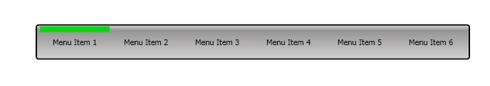
Image 1

Image 2

Let us start with code, below is the xaml of the grid which is used as the menu. Here I have inserted 6 columns of 100 with and 2 columns of with 5 on each side of the , so that equal space is maintained on both end of the grid. In the code there are some important point which I want to mention here. First is that I have one MouseEnter event handler for all the labels I have six label in the grid and I have use same event MouseEnter event handler. Second point is that I have used the Panel.ZIndex and set 1 for that labels and 0 (zero) for the moving border, so that the label are remain at top of the border, if you reverse the Panel.ZIndex of label to 0 (zero) and 1 for the border control, when border is expended in height then you can't see the label.

<Grid Width="610" Height="50">
<Grid.ColumnDefinitions >
<ColumnDefinition Width="5"></ColumnDefinition>
<ColumnDefinition Width="100"></ColumnDefinition>
<ColumnDefinition Width="5"></ColumnDefinition>
</Grid.ColumnDefinitions>
<Border Grid.ColumnSpan="8" CornerRadius="3" BorderBrush="Black" BorderThickness="2">
<Border.Background>
<LinearGradientBrush EndPoint="0.5,1" StartPoint="0.5,0">
<GradientStop Color="#FF6E6E6E" Offset="0"/>
<GradientStop Color="#FFCECCCC" Offset="0.974"/>
<GradientStop Color="#FF969595" Offset="0.151"/>
<GradientStop Color="#FFCECCCC"/>
</LinearGradientBrush>
</Border.Background>
</Border>
<Label Content="Menu Item 1" Grid.Column="1" Margin="2" VerticalContentAlignment="Center" HorizontalContentAlignment="Center" Panel.ZIndex="1" MouseEnter="Label_MouseEnter"/>
<Label Content="Menu Item 2" Grid.Column="2" Margin="0,2,0,2" VerticalContentAlignment="Center" HorizontalContentAlignment="Center" Panel.ZIndex="1" MouseEnter="Label_MouseEnter"/>
<Label Content="Menu Item 3" Grid.Column="3" Margin="0,2,0,2" VerticalContentAlignment="Center" HorizontalContentAlignment="Center" Panel.ZIndex="1" MouseEnter="Label_MouseEnter"/>
<Label Content="Menu Item 4" Grid.Column="4" Margin="0,2,0,2" VerticalContentAlignment="Center" HorizontalContentAlignment="Center" Panel.ZIndex="1" MouseEnter="Label_MouseEnter"/>
<Label Content="Menu Item 5" Grid.Column="5" Margin="0,2,0,2" VerticalContentAlignment="Center" HorizontalContentAlignment="Center" Panel.ZIndex="1" MouseEnter="Label_MouseEnter"/>
<Label Content="Menu Item 6" Grid.Column="6" Margin="0,2,0,2" VerticalContentAlignment="Center" HorizontalContentAlignment="Center" Panel.ZIndex="1" MouseEnter="Label_MouseEnter"/>
<Border Grid.ColumnSpan="8" BorderThickness="1" Grid.Column="1" Width="100" Height="10" VerticalAlignment="Top" HorizontalAlignment="Left" Background="#FF00DA0E" Margin="0,2,0,0" RenderTransformOrigin="0.5,0.5" x:Name="brdBorder" />
</Grid>

Third point is that I have set the width of the brbBorder control to 100 as I have set the column width of each label containing column to 100 so that brbBorder control will fill the current column. Forth point is that I have set the Grid.ColumnSpan of the brbBorder to 8 so that it can be moved in whole grid by changing the x position of the brbBorder control.
Below is the C# code which is used to animate (move the border control) to give location within the .2 second time interval.

int intGridColumn = Grid.GetColumn(lblSender) - 1;
TranslateTransform animatedTranslateTransform = new TranslateTransform();
brdBorder.RenderTransform = animatedTranslateTransform;
RegisterName("AnimatedTranslateTransform", animatedTranslateTransform);

DoubleAnimationUsingKeyFrames translationAnimation = new DoubleAnimationUsingKeyFrames();
translationAnimation.KeyFrames.Add(new LinearDoubleKeyFrame(intPreviousValue, KeyTime.FromTimeSpan(TimeSpan.FromSeconds(0))));
translationAnimation.KeyFrames.Add(new LinearDoubleKeyFrame(intGridColumn * 100, KeyTime.FromTimeSpan(TimeSpan.FromSeconds(.2))));

DoubleAnimation dblaHeight = new DoubleAnimation();
dblaHeight.BeginTime = TimeSpan.FromSeconds(.2);
dblaHeight.Duration = TimeSpan.FromSeconds(.1);
dblaHeight.To = 48;

intPreviousValue = intGridColumn * 100;

Storyboard.SetTargetName(translationAnimation, "AnimatedTranslateTransform");
Storyboard.SetTargetProperty(translationAnimation, new PropertyPath(TranslateTransform.XProperty));
Storyboard.SetTargetName(dblaHeight, brdBorder.Name);
Storyboard.SetTargetProperty(dblaHeight, new PropertyPath(Border.HeightProperty));

Storyboard strbStoryboard = new Storyboard();
strbStoryboard.Children.Add(translationAnimation);
strbStoryboard.Children.Add(dblaHeight);

strbStoryboard.Begin(this);
UnregisterName("AnimatedTranslateTransform");
In the above code I have uses an instance of the LinearDoubleKeyFrame class to move the green border along a path at a steady rate from its starting position to the new position which is calculated by getting the grid column of the mouse entered label and then multiple it with the column index. Linear key frames like LinearDoubleKeyFrame create a smooth linear transition between values. I have used two LinearDoubleKeyFrames which are added DoubleAnimationUsingKeyFrames object, First one is used to the border to the location where it was on last time ( with time interval of 0 (zero) seconds) and second one is used to move the border smoothly to new location. Next I have the doubleAnimtion object which is used to expand the height of the border when the border is moved to the new location, as I have set the begin time of .2 second which is the time to complete the movement of the border from one location to another location. I have also registered the name of the TranslateTransform object which is "AnimatedTranslateTransform" which is used to set the target of the DoubleAnimationUsingKeyFrames object and when I have started the animation I have unregistered the name of "AnimatedTranslateTransform" , So that when mouse point to new location on the menu it will create same name object and animate again, if I don't unregistered then it will execute on first time but for second time onward it will give exception and will not animate.
One more important point is that I have check the height of the border in MouseEnter event so that if the border has maximum height then it will reduce its height to original height which I have set is 10 pixel and when reduced height animation is complete then it will move to new location and then increase height. Hope you get some understanding of the DoubleAnimationUsingKeyFrames object to used it in C# code. You can download the source code from here
All and any comments / bugs / suggestions are welcomed!

Tuesday, March 23, 2010

DataForm SilverLight 3.0 Control

In this post I will show you how you can use the Data-form control of the Silverlight 3.0 control. It is for beginner, persons who are just starting their learning of the Silverlight development and trying to learn the silverlight. When I used the dataform control for the first time I have many questions in my mind, which I think many of you may also have. Let us start our example code and I will try to find and give you the answer of the question which was in my mind and may be in your mind as well. I have just one form which consist of dataform control and below is the my xaml for the dataform control, here you can see that I have set the AutoGeneratedField of the dataform Set to true, mean when I assign the ItemSource of the dataform then it will generate the fields to be displayed.

< dataFormToolkit:DataForm Margin="52,5,0,0" x:Name="myDataForm" AutoCommit="False"
AutoEdit="False" VerticalAlignment="Top" Header="My First Rich Data Form" HorizontalAlignment="Left"
Width="400" Height="423" AutoGenerateFields="True" >
< /dataFormToolkit:DataForm>
And below is the output of the example code when I set the ItemSource of the dataform control. Here you can see that all the fields are displayed. And you can also see that the Header of the control is displayed which I have set in the properties of the dataform control which is " My First Rich Data Form". In the above xaml code you can also see that the I have set the AutoEdit to false mean when record is displayed then it will be displayed in the readonly manner not in the edit mode , In ordered to edit the record you need to press the edit button on the header of the control.You can also see that in the header there are also other buttons like add, delete , next , last, previous and first for viewing the records. Let us starts with the question which were in my mind to learn this control.

Image 1

1- How to change Label Text:
First question in my mind was how to change the label text if you see the image 1 then you can see that the property names are displayed as label text. In order to change the label text you can set the name of the DisplayAttribute of the properties. For example for the here is my code to set the label for the properties.

[Display(Name="Email Address:")]
public string EmailID { get; set; }
After setting the displayAttribute name value you can see the output in the below image here you can see that all the labels are well set. Here you can see the I have set the EmailID property name to Email Address: which is shown in the below image. Similarly I have set the labels of the other properties like UserID, FirstName , LastName etc to User ID, First Name: , Last Name respectively.

Image 2
2- Required Fields:
My second question to myself was how to set the field which are required. This question was answered by the RequiredAttribute of the DataAnnotations. You can set the ErrorMessage which will be shown when user tries to save the new record or edit the record. Here is the code to set the required fields.

[Display(Name="User ID:", Description="User ID is required.", Order=1)]
[Required(ErrorMessage = "User ID is required.")]
public string UserID { get; set; }
And here is the output to which shows the required fields in the bold.

Image 3
In the image 3 you can see the labels are bold for the field User ID, First Name, Last Name and for Phone number , as I have set the RequiredAttribute of these fields. When you click on the edit or add record button on the top of the dataform, then dataform will validate the required field by showing error summary at the bottom of the form.

3- Description:
In order to set some description of the field. In order to set value for this , again you have to use the description of displayAttribute. You can specify a description for a property. If you'd like to display a field's description, you can use the DescriptionViewer control, which handles this for you automatically. It will display an information glyph that provides a tooltip containing the description of the property it is associated with. Below is the Image which will show the Description view for the fields for which I have set the description.

Image 4


4- Validation:
In order to do validation for the user inputs. You can sue the StringLength and regularExpression etc to validate user input and restrict user input.Below is the code which is using these two attribute. For stringLength you need to give the maximum length user can entered in the input filed and also the ErrorMessage which is shown when user click the save button.

[Display(Name="First Name:", Description="First Name is Required.",Order=2)]
[StringLength(100,ErrorMessage="First Name should be less then 100 characters.")]
[Required (ErrorMessage ="First name is required.")]
public string FirstName { get; set; }

[Display(Name="Phone Number:")]
[Required(ErrorMessage = "Phone number is required.")]
[RegularExpression(@"^\d*",ErrorMessage="Only digits are allowed.")]
public string ContactNumber { get; set; }
You can see the output in the Image 5 where message summary is shown to display the errors when user click the save button .

Image 5

Moreover you can set a field to readonly by using the Bindable attributes which take the boolean value to indicate whether property is bindable or not true mean bindable and false mean not bindable and field will not be shown in the dataform. And second parameter is BindingDirection enum which is either OneWay or TwoWay. OneWay mean you can read the value but can't change but in twoWay case you can change the value of the the property on dataform.You can explorer more about dataform control, this is the starting point about the dataform control, hope you get initial starting point about the dataform control.You can download the source code from here
All and any comments / bugs / suggestions are welcomed!

Monday, March 15, 2010

DatePicker Control SilverLight 3.0

During my work in silverlight project I have used datepicker control and found it different behavior and I would like to share with you ( many of you may know about it , but for those whose are beginner or didn't use the datePicker control yet.) . The problem is given blow.
When user enter some invalid text, or some other character using keyboard, then the text property doesn't show the user entered text which is invalid, But the arguments in the DateValidationError function does containt the invalid user input in the e.Text property, how do I get that invalid user input from the datepicker control text property ?
I have also post this problem ins stackoverflow and I have not get any answer till today date (15-Mar-2010). The reason to mention about stackoverflow here is to not link this post as answer to the that question if you find it on the stack over flow site.And I have not check the latest version of the silverlight which is release in beta mode(might be that behavior is fix by them).
Solution:
The solution to to problem is very simple as I have created my own user control which will be used as datepicker control. which will consist of text box control and a datepicker control in silver light user control. Here is the main form of the example code which is consist of user control which I have created and the second one is the datepicker control of silver light. I have place both the control here so that you can see the behavior of both the control. The text property of the user control which I have created will also return invalid text which is entered by the user but in case of the silver light datepicker control it is empty string.


Here is the xaml for the custom datepicker which I have create. Here you can see that I have a textBox control and a DatePicker control. Both controls are positioned in such a way that they looks like the datepicker of the silverlight. I have set the width of the date picker control to 24 so that only the icon part of the date picker is shown and when user click on the calender button calender will be opened.

<TextBox x:Name="txtDateTimeValue" Grid.Column="0" MaxLength="10" BorderThickness="1" Height="23" Margin="0,0,26,0" LostFocus="txtDateTimeValue_LostFocus" GotFocus="txtDateTimeValue_GotFocus" />
<controls:DatePicker x:Name="dtpDatePicker" Grid.Column="1" Margin="4,4,2,4" Width="24" HorizontalAlignment="Right" SelectedDateChanged="dtpDatePicker_SelectedDateChanged" FirstDayOfWeek="Monday" BorderThickness="0" />
Two TextBox control are registered one for GotFocus and second one is the LostFocus these two events are used to display water mark in the text Box control same like the datePicker control has the water mark. Moreover I have also set the MaxLenght of the TextBox control to 10 so that user can 't enter more the 10 character in the textBox control when entering the date manually. As date consist of 2 digit for day , 2 digit for month and 4 digit for year and two (/) signs.And One SelectedDateChanged event for the datePicker control which is used to assign the selected date to the textBox control.
The important properties of the custom datepicker are as follow.
1- Text
The text property is used to get/ set the value of the text box which is either entered by user or by using the calender control.

2- IsTextReadOnly
IsTextReadOnly is the property which is used to make the text box readonly so that user can 't enter date by using keyboard, user can only entered date from the date picker control. I think sometimes we don't want user to enter date from the keyboard as we (developer) then has to check for the validity of the user input, that is why I have created this property.

3- IsValidDate
IsValidDate is the property which will validate user input when called. It will return boolean value true mean valid date and false mean invalid date. The border of the text box is also set to red to indicate invalid date.

Above are the some of the important properties, below is the private funtion which is used to convert the user input to the proper date format. Here you can see that I have placed the if condition to check the user input which should be greater then or equal to 8. Then in the next statement I have used the TryParse of integer type to convert the user input, If user entered only digits in the text box control the TryParse will be executed successfully and will return true value and the converted value is stored in the out paramenter which is intDateValue. Next I have place if conditio to check the intDateValue for its default value as if the TryParse fail then the out parameter will hold the previouse value.
private void ConvertToDate()
{
if (txtDateTimeValue.Text.Length >= 8)
{
Int32 intDateValue = 0;
int.TryParse(txtDateTimeValue.Text, out intDateValue);
if (intDateValue != 0)
{
DateTime dateTime = new DateTime();
string format = "ddMMyyyy";
CultureInfo provider = CultureInfo.InvariantCulture ;

dateTime = DateTime.ParseExact(txtDateTimeValue.Text, format, provider);
txtDateTimeValue.Text = dateTime.ToString(CustomFormat);
}
}
}

In the if condition I have declared and initialize the dateTime object and then a string variable to hold the format of the date and then I have declared teh CultureInfo object and initialized it in the next statement I have used the ParseExact of DateTime class which will converts the specified string representation of a date and time to its DateTime equivalent using the specified format and culture-specific format information. The format of the string representation must match the specified format exactly.The in the next statement I have used the ToString of the dateTime object and pass the format of the date time and assign it to the textBox control. Now if user enter 12122010 it will be converted to 12/12/2010.
Now if you entered invalid dates in both control then you can see that first one return value but the other one will return empty string. But as I have mentioned in my question that if you check the DateValidationError event handler of the datepicker control you can see the value in the parameter e, but not in the text property of the datepicker control.You can download the source code from here
All and any comments / bugs / suggestions are welcomed!

Saturday, March 13, 2010

TimeSpan Structure

In this post I will show you how you can use the TimeSpan structure, I know many of you have used it and know how to use the TimeSpan structure, But this post is for those who have never used it or for the beginner level readers.
A TimeSpan object represents a time interval (duration of time or elapsed time) that is measured as a positive or negative number of days, hours, minutes, seconds, and fractions of a second. The TimeSpan structure can also be used to represent the time of day, but only if the time is unrelated to a particular date. Otherwise, the DateTime or DateTimeOffset structure should be used instead.
For my example code (which I have develop desktop application using visual studio 2008) I have just tried to make simple time calculate which is used to Subtract the first date time value from the second date time value. For this I have two date time picker controls and two buttons one to calculate and second one to reset the values. Below is the image of the main form, which is taken by setting the difference of one day between two dates control. You can see in the example code that I have used the costomFormat of the date by setting the Format of the control to custom and I have used the dd/MM/yyyy HH:mm for both controls, So that time can also be displayed.


Here is my code which is used to assign the result to the TimeSpan object.

TimeSpan tsDateDifference = dtpSecondDate.Value.Subtract(dtpFirstDate.Value);
After you have set the value of the TimeSpan object here are the list property which you can use to get the result. And I have used all of them in my example code.

Property
Description
DaysGets the days component of the time interval represented by the current TimeSpan structure.
HoursGets the hours component of the time interval represented by the current TimeSpan structure.
MillisecondsGets the milliseconds component of the time interval represented by the current TimeSpan structure.
MinutesGets the minutes component of the time interval represented by the current TimeSpan structure.
SecondsGets the seconds component of the time interval represented by the current TimeSpan structure.
TicksGets the number of ticks that represent the value of the current TimeSpan structure.
TotalDaysGets the value of the current TimeSpan structure expressed in whole and fractional days.
TotalHoursGets the value of the current TimeSpan structure expressed in whole and fractional hours.
TotalMillisecondsGets the value of the current TimeSpan structure expressed in whole and fractional milliseconds.
TotalMinutesGets the value of the current TimeSpan structure expressed in whole and fractional minutes.
TotalSecondsGets the value of the current TimeSpan structure expressed in whole and fractional seconds.

Hope you will some idea of how to use the TimeSpan structure in you code when you need to have some calculation in your project and that calculation depends on Total hours , total minutes etc in your code. You can download the source code from here
All and any comments / bugs / suggestions are welcomed!

Saturday, March 6, 2010

AutoCompleteBox SilverLight 3 Control

In this post I will show you how you can get started with the AutoCompleteBox control in the silverlight 3.0 . Here is the simple screen for my example code. Here I have added one text block control, one autoComleteBox and one button control. Below is the screen shot of the example code.

Here is my xaml code to add the autoComleteBox control . When you drag and drop the autoCompleteBox control from the toolbox then the default xaml will be written, rest of the properties has been set by me, like grid column and row, margin etc. And Also namespace is added in the user control tag.

// namespace will be added at top. in xaml
< UserControl xmlns:input="clr-namespace:System.Windows.Controls;assembly=System.Windows.Controls.Input" ... />

< input:AutoCompleteBox Height="23" x:Name="acbAutoCompleteBox" Grid.Row="1" Grid.Column="2" Margin="3,2" VerticalAlignment="Center" IsTextCompletionEnabled="True"/ >
Here is the output of my example code. you can see that when user type it will show suggestion about user input, possible match in the item source.


Note that I have set the IsTextCompletionEnabled property to true in my xaml which will used to display first possible match found during the filtering process automatically in the text box.Ordinarily, the AutoCompleteBox filters out the list of bound items by comparing the start of each one with the text that’s been typed in so far. However, you can change this behavior by setting the FilterMode property. It takes one of the values from the AutoCompleteFilterMode enumeration.
Property
Description
NoneNo filtering will be performed, and all the items will appear in the list of suggestions. This is also the option you’ll use if you need to fetch the collection of items yourself–for example, if you need to query them from a database or request them from a web service.
StartsWithAll the items that start with the typed-in text will appear. This is the default.
StartsWithCaseSensitiveAll the items that start with the typed-in text will appear provided the capitalization also matches.
ContainsAll the items that contain the typed-in text will appear. For example, typing ember would match September, November, and December.
ContainsCaseSensitiveAll the items that contain the typed-in text will appear provided the capitalization also matches.
CustomYou must perform the filtering by applying a delegate that does the work to the TextFilter or ItemFilter property. In fact, if you set TextFilter or ItemFilter the FilterMode property is automatically switched to Custom.

You can set any of the value from the above table to the FilterMode of the autoComplteBox control, But the default value for the FilterMode is StartsWith. So if you don't set the FilterMode for the autoCompleteBox then it has StartsWith as default mode.Hope you get some idea of how to use the autoCompleteBox. You can download the source code from here
All and any comments / bugs / suggestions are welcomed!

Thursday, March 4, 2010

How to Set Default Browser in Visual Studio

In this post I will show you how you can change the default browser for your web application in visual studio. Here are the step you have to follow in order to change the default browser for the visual studio web application
1- Right click on any of the file which has extension like .aspx, .html, .svc .asmx then you have the Browse with... option as shown in the below image.


2- By clicking on the Browse with... option you have small dialog open as shown in the below image , Click on any of the browser if you have multiple browser and the click on the Set as Default button on the dialog and your default browser for the web application is changed

In my case I have changed to the Internet Explorer , you can change to fire fox or if you have any other browser then you can change it from here.
All and any comments / bugs / suggestions are welcomed!