Sunday, October 31, 2010

DataPager Silverlight Control for Beginners

It was a long time when I have post on silverlight data grid control, at that time I was thinking of posting complete series of the post on the data grid control I have posted on the data grid grouping control but I didn't post on the paging of the data grid records. Now after long time I have time to see the silverlight and its paging control, I know there are lot of tutorial regarding data pager control But I have this for the absolute beginner who are just started  their journey of the Silverlight.
For this example I have two controls added in my xaml are one is the data grid control and the second one is the data pager control.
You can see the code for the data grid control and the data pager control in the List 1, Here you can see that I have set the properties of the data grid control like auto generate columns to false mean I will set the columns for the data grid control, IsReadOnly is set to false mean this grid is used for the display of data and the vertical and horizontal grid line brush and GridLinesVisibility is set to All to show both the horizontal and vertical lines.

<sdk:DataGrid Grid.Column="1" Grid.Row="1" AutoGenerateColumns="False" IsReadOnly="True" GridLinesVisibility="All" HorizontalGridLinesBrush="{StaticResource Brush_BorderOuter}" VerticalGridLinesBrush="{StaticResource Brush_BorderOuter}" x:Name="dgrdDataGrid" VerticalAlignment="Top" Height="296"> <sdk:DataGrid.Columns> <sdk:DataGridTextColumn Binding="{Binding UserID}" Header="User ID"/> <sdk:DataGridTextColumn Binding="{Binding FirstName}" Header="First Name"/> <sdk:DataGridTextColumn Binding="{Binding LastName}" Header="Last Name"/> <sdk:DataGridTextColumn Binding="{Binding EmailID}" Header="Email"/> <sdk:DataGridTextColumn Binding="{Binding ContactNumber}" Header="Contact No."/> </sdk:DataGrid.Columns> </sdk:DataGrid> <sdk:DataPager x:Name="pgrPersons" PageSize="5" Grid.Column="1" Grid.Row="1" VerticalAlignment="Bottom" Background="#FF333333" Foreground="#FFE5E5E5" BorderBrush="Black" />
List 1

Next is the xaml for the data pager control which you can see in List 1.The properties which are set for the data pager control are the PageSize indicates the number of items displayed on a page which I have set for 5. Mean 5 records are shown per page as you can see in the output of the example code.
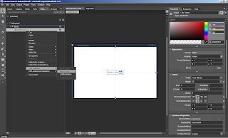
The second property which is important is the Display mode of the data pager control.The possible value of the Display and there look can be seen in the Image 1 which is taken from here. For my code I have used the FirsLastPreviouseNext display mode that is why the display mode property is not used as it has the default value.

Image 1

The code for the code behind used to set the ItemSource of the data grid control and the data pager control is listed in the List 2, here you can see that I have used the PagedCollectionView class because the data pager control take the PagedCollectionView as data source. The PagedCollectionView to provide grouping, sorting, filtering, and paging functionality for any collection that implements the IEnumerable interface.

dgrdDataGrid.ItemsSource =new PagedCollectionView(Persons.GetDataItems()); pgrPersons.Source = dgrdDataGrid.ItemsSource;
List 2

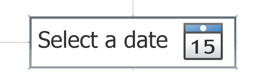
In the second statement which I have set the ItemSource Property of the data pager control to the Item source of the data grid control.These are the two lines of code which is placed at the user control loaded event handler . The output of the example code can be seen in the Image 2.


Image 2
The data pager control provide the user interface for paging through a collection of data. As you can seen that I have not right any code for the data pager control all the paging navigation to the next previous, and to first and last page is done by the control itself.The paged data is typically displayed in a control that represents a collection, such as a DataGrid or ListBox. To use a DataPager to page through data in another control, you assign the control's ItemsSource property and the DataPager.Source property to the same data collection.I hope you get starting point on how to use the data pager control and used it with the control like data grid.You can download the source code from here.  

All and any comments / bugs / suggestions are welcomed!

Saturday, October 30, 2010

TextBox Control WPF 4.0

I have used the Text Box control quite a lot in my project and I am sure many of you have also used it in your project as It is the basic control which is used to get user input.When reading details about the text box control I have found some of the new things which are in for the WPF 4 text box control and I have never used some of them in my project. Now I will share this with you some of the useful properties of the Text box control.

MultiLine :
    In many application you have used the text box control where you want to enter large in the text box control like the description is one of the example. For this case user can enter text in the text box control in multiple line. So in order to allow multiple line support use property AcceptsReturn which is used to entered the Enter key.

Image 1

TextBox always supports multiple lines of text programmatically. If  string which is assigned to the Text property of the text box containing NewLine characters like \n in C#, it displays the multiple lines regardless of the value of AcceptsReturn. Also, the multiline support is completely independent from text wrapping. Text wrapping applies only to individual lines of text that are wider than the TextBox.


Spell Checking :
         Spell checking can be enabled on the text box control by setting the SpellCheck.IsEnabled to true. When you set the SpellChek.IsEnabed to true then text box control will automatically detect the wrong word and underlined these words with red line as see in the Image 2, the similar kind of behavior you have seen while typing in the Microsoft Word. Now as you  have experience it  in Microsoft Word that you can right click on the red underlined word and it will give you suggestions of the word in list box. From the list of the suggested option for the wrong word you can choose the correct word.

Image 2

In the Image 2 you can see that I have entered wrong words like wrog entere and TextBox. You can place mouse on any of the word and select the correct word from the suggestion which are appears by right clicking on the word

All and any comments / bugs / suggestions are welcomed!


Wednesday, October 27, 2010

Changing DatePicker Label

To change the label of the date picker control in WPF is very easy. When you drag and drop the date picker control from the toolbox then it will show 15 as default, It will be nice to show current day is comfortable to show the current date.Image 1 shows the default date picker control when you drag and drop it from the toolbox here you can see that it display 15 which we want to change to show the current date.

Image 1

Here are the steps which are used to change the default 15 to the current date in the date picker control in style. First you have to open the project in the expression blend and then follow the step as describe below.
Step 1:
In the first step select the date picker control from the object and time line as we can see in the Image 1. and then right click on the control and from the Edit Template select the edit current. A dialog will open which will ask you for the name of the style or apply to the all the control of date picker in this case. I have used the default style name "DatePickerStyle1".
Image 2
Step 2:
Now the style is generated using the step 1. Now from the Resource Right click on the "DatePickerStyle1" as shown in the Image 3 and you can see the style in the Object and time line.
Image 3
Step 3 :
Now in object and time line right click on the style and select Edit Current from the edit Template option as you can see in the Image 4.
Image 4
Step 4 :
Now in the PART_ROOT select the PART_BUTTON by right clicking on the PART_BUTTON Select the Edit Current from the Edit Template and you will have the PART_Button Template as you can see in the Image 6.
Image 5
Step 5:
In last step locate the path which is show to display the 15 in the date picker as I have highlighted in the Image 6. The highlighted path is used to display 15 in the date picker control.
Image 6
Now replace the xaml of the select path with the xaml of the text block as show in the list 1 and add the mscorlib reference in the xaml as I have used the system namespace to get the current date and assign it to the text property of the text block control.

xmlns:System="clr-namespace:System;assembly=mscorlib" <TextBlock Margin="2,0" Grid.Row="1" Grid.RowSpan="3" Grid.ColumnSpan="4" Grid.Column="0" Text="{Binding Source={x:Static System:DateTime.Now}, StringFormat=dd}" HorizontalAlignment="Center" VerticalAlignment="Top" FontSize="10.667" FontFamily="Arial Bold" />
List 1

And final outpout of all the above steps are shown in the Image 7 which shows the current date on the date picker control.You can download the source code from here

Image 7


All and any comments / bugs / suggestions are welcomed!

Monday, October 25, 2010

Forcing View Validation On Save using MVVM Pattren

In this post I will show you how to force the validation rules when user click on the save button without entering any thing in the user input form.Simple scenario is when user open the form and without entering any thing in the input control he/she press save button, if you see the UpdateSourceTrigger it has the default (The default value for most dependency properties is PropertyChanged, while the Text property has a default value of LostFocus.), explicit (Updates the binding source only when you call the UpdateSource method.), lost focus (Updates the binding source whenever the binding target element loses focus.) and property changed (Updates the binding source immediately whenever the binding target property changes.). If you didn't set default focus on any of the control when form open then lost focus of any of the control will not be fired and user didn't entered any value in the user input control so the property changed will also not fired So you have to check the validation rules before saving the user input form.
You have to check the user input validation on view, mean when user click the save button without entering anything in the input control then view should check if there are required field on the which need to be check before saving the form.Let us start with  the example code to force the validation of the input control from the view. For this I have used same example code which is used in the Range Validation Rule post, I have made some modification in the view model and also in the view so that when user click on the save button then the view will check the required field validation which is asked by the view model. Let us discuss what need to be done in order to ask the view to validate the user input.

View Model :
         In view model I have made the changes which are listed in the List 1. Here you can see that I have used the delegate which return the Boolean type and then In the CammandExecute I have call the ValidateView function to check the validation of the view.

public delegate Boolean dlgValidateView(); public dlgValidateView ValidateView; private void CommandExecute() { if (ValidateView()) { MessageBox.Show(Person.FullName); IsDialogClose = true; } else MessageBox.Show("Some Error on the View"); }
List 1

If the view is free of error then I will display the full name of the person as first and the last name of the person are required and then close the dialog. In the else statement I have just shown the message that there are some error on the view end. The dialog will only close if there is no error else if will not closed.

View :
     The code for the view is listed in the List 2, Here you can see that I have two sample of code which is of window loaded function and for the ValidateView function ( I have write code for one user id text box the remain code in the ValidateView is same).
In the loaded function I have check for the DataContext for not null and then assign the function ValidateVeiw function to the ValidateView of the view model which is set as data context of the Person view.

// window loaded code if (DataContext != null) ((PersonViewModel)DataContext).ValidateView = ValidateView; //Code for the Validate View function Boolean blnIsValid = true; BindingExpression bindingExpression; bindingExpression = txtUserID.GetBindingExpression(TextBox.TextProperty); if (bindingExpression != null) { bindingExpression.UpdateSource(); if (bindingExpression.HasError) blnIsValid = false; }
List 2

In the ValidateView function I have simple code, starting with the blnIsValid variable of type Boolean which is return from the ValidateView function and if any of the control has some error then blnIsValid variable is set to false to indicate that error on the view and the message is shown in the tool tip of the control.
Next is the BindingExpression object which is used to save the binding expression of the binding object in this case the objects are the text box controls. Next is to call the GetBindnigExpression of the user id text box control which Returns the BindingExpression that represents the binding on the specified property. Next is to check the binding expression for null if there is no active binding for the specified property in this case is the Text property which is passed to the GetBindingExpression.
If the binding expression is not null , mean the binding object has active binding then its time to update it, I have used the UpdateSource method Sends the current binding target value to the binding source property in TwoWay or OneWayToSource bindings. 

Image 1
After the UpdateSource function call next is to check the error by using the HasError property which will return true in case there is error after calling the UpdateSource function and then set the blnIsValid to false as the validation is fail. Some code is used for the first name, last name, email address and the contact number. By this way the view can tell the view model that there are some error in the view as user didn't entered any input in the control and is want to save the form.
Hope you get some idea about how to perform the validation on the when you are using the Validation rules.The output can be seen in the Image 1 which is displayed above when user open the form and want to save the form without entering any input.You can download the source code from here.  

All and any comments / bugs / suggestions are welcomed!


Sunday, October 24, 2010

Auto generation of Properties (Shortcut keys)

In this post I give you some useful tips for auto generation of the properties.The code snippet which is quite useful are
  1. prop
  2. propa
  3. propdp
  4. propfull
  5. propg

1- prop :
when you type prop in the visual studio editor and hit tab it will create property of int type with the name MyProperty, which you can see in the Image 1 as shown below. You can see in the image that the data type and the name of the property are of yellow background , mean you can change the data type and the name of the property.

Image 1

2- propa :
The real benefit of using the code snippet is when you write propa and press tab key, you can see the code generated  in the Image 2, here you can see that data type is int and the name of the property is GetMyProperty. In the Image 2 you can see the default focus is on the data type of the property and all the reference of the data type in the generated code are highlighted with dotted rectangle as you can see in the Image 2. When you change the data type and press tab key all the highlighted data types are changed to the data type which you entered in this case I have changed it to the string data type.
Image 2
Now it time to change the name of the property. As you can see in the Image 2 that property is the GetMyProperty. When focus is on the GetMyProperty then all the occurrence of the MyProperty are highlighted with dotted rectangle now change the MyPrperty in GetMyProperty to whatever name you want to give, I have changed it to FirstName and hit tab key all the occurrence of  MyProperty is changed to FirstName. Which you can see in the Image 3 as below.
Image 3
The last thing you have to do is provide the name of the class who is owning this property and you can provide it in the ownerclass which is underline red in the Image 2 and Image 3.

3- propdp :
When you write propd and press the tab key then code for the dependency property is generated which can be seen in the Image 4.  Here you can see the default data type is int and the default name of the property is MyProperty.

Image 4
Now you can change the data type and the dependency property name which is described in propa for the attached property.

4- propfull :
When you type propfull and press the tab key then it will generate the code which is shown in the image 5, here you can see that it has private variable and public property, by default the data type of the variable is int and the name of the variable is myVar and the property name is MyPropery.
Image 5
As you can see in the Image the data type, the variable name and the property name are background of yellow mean you can change them by changing the data type first and press tab key then the variable name and press key and at the end property name and press key, you don't need to use the mouse for this, all this can be done by using the tab key.

5- propg :
When type propg and hit the tab key the code generated is shown in the Image 6, here you can see that property is generated with private setter.
Image 6


As we use more properties in our applications it is quite easy to remember these code snippet and generate code for the properties , attached properties and dependency properties.

All and any comments / bugs / suggestions are welcomed!


Saturday, October 23, 2010

Range Validation Rule

In this post I will show you one of the rule which is quite often used in applications is the Range validation, To check the range of the input user control so that user can't enter less or more then the minimum and maximum value respectively. In my previous post I have show you how to use the validation rules you can read it if you don't have any idea about the validation rules.This post is the continuity of the previous post.
Let us start with the range validation rule example. The example code for this example is the same as I have used for the previous post I have added new validation rule with the name of the RangeValidation in the ValidationRules folder, where all the validation rules are placed.In the List 1 you can see the complete class for the RangeValidation rule. Here you can see that I have three properties one for the MaximumLength  and MinimumLength for checking the maximum values entered in the user input control and to check the minimum value entered by the user in the input control respectively.

public class RangeValidation : ValidationRule { public int MaximumLength { get; set; } public int MinimumLength { get; set; } public string FieldName { get; set; } public override ValidationResult Validate(object value, System.Globalization.CultureInfo cultureInfo) { string strValue= value as string; int intLength = (strValue == null) ? 0 : strValue.Length; if ((intLength > MaximumLength) && (MaximumLength > 0)) return new ValidationResult(false, string.Format("{1} should be no longer than {0} characters.", MaximumLength, FieldName)); if (intLength < MinimumLength) return new ValidationResult(false, string.Format("{1} should be no shorter than {0} characters.", MinimumLength, FieldName)); else return new ValidationResult(true, null); } }
List 1

In the Validate override function you can see that I have first taken the value of the which is passed in the value parameter and then check the length of the string entered by the user by using the conditional operator. Then check for the maximum value if the MaximumLength is greater then 0 as the default value for the int property is 0 if you didn't set the value of the MaximumLength. In the next if condition I will check for the minimum value and if the value is valid then it will return the validation result with true and null parameter mean user input is valid.
In List 2 I have the xaml which is the view end of the example, Here you can see that I have used the range validation only for the first name of the user input control. Here you can see that I have set the maximum length and the minimum length for the user input control and also the name of the field "First name" which is used in the error message.

< TextBox Grid.Row="5" Grid.Column="1" Margin="2,1,20,1" Height="23"> < TextBox.Text> < Binding Path="FirstName" UpdateSourceTrigger="PropertyChanged" Mode="TwoWay" ValidatesOnDataErrors="True" ValidatesOnExceptions="True"> < Binding.ValidationRules> < validationRules:RequiredFieldValidation/> < validationRules:RangeValidation MaximumLength="50" MinimumLength="4" FieldName="First Name"/> < /Binding.ValidationRules> < /Binding> < /TextBox.Text> < /TextBox>
List 2
You can see the out of both the minimum and the maximum check in the Image 1 and Image 2 you can also see that field name is also used in the messages. Which is the First name in this case.
Image 1

Image 2

By using the properties in the validation rule you can pass additional parameter to the validation rules. As the Validate function only two parameter one is the value which is of type object and second one is the culture information but if you used the converter they (converter) can take parameter which is of type object as well. But the Validate function only take two parameter so in order to pass information to the Validate function you can use properties of the class to pass the information to the validate function.Hope you get some idea of how to pass extra information to the validate function.You can download the source code from here.  

All and any comments / bugs / suggestions are welcomed!


Tuesday, October 19, 2010

Math.DivRem Function

In this short post I will show a simple and helpful function for calculating the Quotient and the Reminder when doing math calculation.The System.Math static class contain the function with the name DivRem which is used to get the quotient and the remainder when dividing one value to the second value.Math.DivRem calculate the quotient of two 32-bit signed integers and also returns the remainder in an output parameter.

int intQuotient = 0; int intRemainder = 0; intQuotient= Math.DivRem(19, 5, out intRemainder); Console.WriteLine("Reminder: {0} and Quotient : {1}", intRemainder, intQuotient); Console.ReadKey();

The output of the above code will be, Here you can see that remainder is 4 and quotient is 3 when dividing 19 with 5.

Reminder: 4 and Quotient :3

The parameter which are passed to the Math.DivRem are.
1- The first parameter will be dividend.
2- The second parameter will be Divisor.
3- The third parameter will be the remainder as output.

The Math.DivRem method performs an essential function for certain mathematical programs. If you need to calculate the remainder and store it after a division operation, use the Math.DivRem method instead of the division (/) or modulo (%) operators.


All and any comments / bugs / suggestions are welcomed!

Sunday, October 17, 2010

Validating User Input Using ValidationRule

In my post Input Validation using MVVM Pattern I have show you how to validate user input using the IDataErrorInfo interface in the MVVM pattern.Now in this post I will show you how to validate user input using the ValidationRule class.The ValidationRule has one abstract method which is used to write the logic for the validation of the input.I have used same example as I have used in the Input Validation using MVVM Pattern but instead of using the IDataErrorInfo interface I have used the ValidationRule class and its abstract method.
Let us start with our example code of how to validate the user input using the ValidationRule class using MVVM.I have create separate folder for the modal, view modal and the view and also for the resource dictionary I have create the theme folder and for the ValidationRule I have create ValidationRules folder all my classes which are inherit from ValidationRule class are placed here. So that all the validation rules can be found by placing on reference at the top of the view.

Model:
         In model I have one class with name PersonModel which has the UserID, Fist Name, Last Name, Full Name,EmailID, Contact Number and Date of birth properties. The PersonModel class is inherit from the INotifyPropertyChangedProperty interface So that in case of the change in the data in the modal is , it will send back the new changes to the view, As in case of the First Name and Last Name which are changed and send back to the view to display the Full name which is raising the Property Changed event of the INotifyPropertyChanged.

ViewModel:
In view model folder I have one class with the name PersonViewModel which has the commands and the properties of binding the control in the view. These properties are the IsDialogClose ( You can find more detail about the IsDialogClose over here. I have discuss in detail about how to close the view from the view model) and the is the Person property of the PersonModel and the save and the cancel command are there.
ValidationRules:
Before discussing the View of the MVV, I will discuss the ValidationRules folder first as I have define the ValidationRules which are placed in the ValidationRules folder.In the List 1 you can see that I have one class with the name  RequiredFieldValidation which is inherit from the ValidationRule and implement the abstract method. You can see that the return type of the Validate method is the ValidationResult in case of invalid date the Validation return is pass the value false along with the error message and in case of valid data the ValidationResult is passed the value true.

public class RequiredFieldValidation : ValidationRule { public override ValidationResult Validate(object value, System.Globalization.CultureInfo cultureInfo) { string strValue = value as string; if ((strValue.Length == 0) || ((strValue.Length > 0) && (strValue.Trim().Length == 0))) return new ValidationResult(false, "Field is required."); return new ValidationResult(true, null); } }
List 1

In the List 1 you can see that I have simple logic for the required field. I will check for the length of the value to be passed and also if the value is empty string then it will also report it as invalid as in some case we will not allow user to enter only the space in the required field.Now our required field is ready. I also have the email validation validator there in the ValidationRules folder which is used to validate the email address.
View:
Now I have validation rules for the user input now it time to bind the rules with the input controls. In List 2 you can see the xaml of the email input control here you see that I have used the the binding tag and set the Path (which is the name of the property define in the model or in view model as I have define in the model so I have set the DataContaxt of the grid which hold the input control like the first name, last name , email address etc, The Person property is define in the ViewModel which is of type PersonModel). The UpdateSourceTrigger is set tot he PropertyChanged which is LostFocus by default. when the value in the text box is change then the validation take place. Mode is set to TwoWay and also the ValidationOnDataErrors and ValidationOnExceptions are set to true.

< TextBox Grid.Row="5" Grid.Column="1" Margin="2,1,20,1" Height="23"> < TextBox.Text> < Binding Path="ContactNumber" UpdateSourceTrigger="PropertyChanged" Mode="TwoWay" ValidatesOnDataErrors="True" ValidatesOnExceptions="True"> < Binding.ValidationRules> < validationRules:RequiredFieldValidation/> < validationRules:PositiveInteger/> < /Binding.ValidationRules> < /Binding> < /TextBox.Text> < /TextBox>
List 2
Next is the binding of the ValidationRules, The Bidning has the property ValidationRules which is used to set the validation rules. Here you can see that for the email validation I have set the Required field validation and also the valid email ValidationRules. Which I have placed in the ValidationRules folder.
The output of the both the validation of the email is shown in the Image 1 and Image 2.

Image 1


Image 2

Hope you get starting point of how to use the ValidationRule for the input validation using MVVM. In application whether it is web or desktop required field validation is common and it is easy to change to change the message or required field validation on common location and later you can change it as well for whole application.You can download the source code from here.  


All and any comments / bugs / suggestions are welcomed!

Sunday, October 10, 2010

Binding Bing Map Pushpin

In this post I will show you how to bind the push pin of the Bing map control using MVVM to show multiple push pin on the map control.In my last post on the Bing map which I have write for the beginners you have seen that I have displayed only one one push pin but now its time to learn how to display multiple push pin on map control.

Modal :
In Modal I have only one class (MapModal) which is used as the source for the map control which have only two properties one is the MapLocation which is of type Location( data type in the Bing map dlls used for latitude and longitude ) and the other property is the TooltipText property used to show the tool tip of the pushpin. And one function which will return the records for the map control of type observable collections.

View Modal :
In View Modal I have only one property of type ObservableCollection with name MapLocations and initialized on the default constructor of the view modal class.

View :
In View I have added the reference of the viewModal namespace in the user control tag and then by using that reference I have give the data context of the user control. Which you can see in the below code as I have set the data context of the user control and then after that I have created template for the MapItemControl which Represents an the class that uses a MapLayer as an ItemsPanel. This enables data binding using an ItemsSource and an ItemTemplate.It consist of one control which is the pushpin and I have bind the Position and the tool tip of the pushpin control.

<UserControl.DataContext > <viewModal:MapViewModal/> </UserControl.DataContext > <UserControl.Resources > <DataTemplate x:Key="PushpinTemplate"> <bingMap:Pushpin bingMap:MapLayer.Position="{Binding MapLocation}" ToolTipService.ToolTip="{Binding TooltipText}" /> </DataTemplate> </UserControl.Resources> <bingMap:Map CopyrightVisibility="Collapsed" LogoVisibility="Collapsed" ZoomLevel="12" CredentialsProvider="AoXaZoKhVUk_qMWVOcaUMOghcav3ZXJTTi5ttGqOcuoG_YNbaY40SKUK-zHpRl2_" Center="47.615820, -122.238973" > <bingMap:MapItemsControl ItemTemplate="{StaticResource PushpinTemplate}" ItemsSource="{Binding MapLocations}"> </bingMap:MapItemsControl > </bingMap:Map >

Next is the map control which has the zoom level, copy right , logo visibility and the center of the map set and then is the MapItemscontrol , I have set the ItemTemplate which I have created in the resource of the user control and the ItemSource which is bind to the MapLocations property defined in the viewModal of the project.When you run the application you can see the output of the example as shown in the Image 1.You can download the source code from here. 

Image 1


All and any comments / bugs / suggestions are welcomed!


Saturday, October 9, 2010

Closing View From ViewModel Using MVVM

In this post I will show you how to close the view from the view model.The problem was to close the window or the dialog box when user has done the save/update operation in the form. So In normal situation when there is no MVVM involved then we can close the window or dialog box when the record is saved in the data base. In case of window we close the window and in case of dialog box we will use the DialogResult property to close the dialog box. Let us start with the example of how to close the dialog or window from viewModel using MVVM.
I have modal, view and view modal folder to keep modal , view and view modal classes separate and also have some other folder to keep the other stuff in separate folder. If you want to learn basic of the MVVM then you can read the following article.Let us discuss the code and the steps which are used to close the view from the view modal in MVVM.
Here is my code which is listed in the List 1 added at the window tag. First I have add the reference of the namespace which define the attached property to close the dialog or window. Then I have Bind the attache property with the property defined in the view model.


xmlns:properties="clr-namespace:Close_View_From_ViewModel.AttachedProperty"   properties:CloseDialog.DialogResult="{Binding IsDialogClose}"
List 1

Next is the attached property which is used to close the dialog or window.So here is the attached property which is used to close the window or dialog box depending on if you are using the show or showDialog function to open the the window.


public static class CloseDialog { public static readonly DependencyProperty DialogResultProperty = DependencyProperty.RegisterAttached("DialogResult", typeof(Boolean?), typeof(CloseDialog), new PropertyMetadata(DialogResultChanged)); private static void DialogResultChanged(DependencyObject pDependencyObject, DependencyPropertyChangedEventArgs e) { var wndWindow = pDependencyObject as Window; Boolean? blnIsModal = System.Windows.Interop.ComponentDispatcher.IsThreadModal; if (wndWindow != null) if (blnIsModal) wndWindow.DialogResult = e.NewValue as Boolean?; else wndWindow.Close(); } public static void SetDialogResult(Window pTarget, Boolean? pblnDialogResult) { pTarget.SetValue(DialogResultProperty, pblnDialogResult); } }
List 2
Here you can see in the List 2 that in the property metatdata that I have checked for the modal dialog and if the window is opened using ShowDialog then this flag will be true and the dialog is closed using the DialogResult else if the window is opened using the show function then window will be closed. So in this case you can use one property to handler both the dialog and window close. As in case of ShowDialog function we can check for the return value of the dialog to take further action if the result from the modal dialog is true.You can download the source code from here. 

The above idea of closing the dialog is taken from the following link.

All and any comments / bugs / suggestions are welcomed!

Monday, October 4, 2010

Using Bing Map Control in Silverlight For Beginners

In this post I will show you how to use the Bing map control in the silverlight application to show the location on map. For this you have to download the SDK for the Bing map control from here. By downloading and installing the Bing map SDK on your system you will have the libraries and the SDK for the Bing map on your system.Now let us start to create the application to use the Bing map.
Now create an Silverlight application and named it I have set the name of the application " Using Map In Silverlight", you can set the name of your choice. Next step is to add the reference of the Bing map control libraries in the application. You can add the "Microsoft.Maps.MapControl.Common.dll" and "Microsoft.Maps.MapControl.dll" which are found in the "C:\Program Files\Bing Maps Silverlight Control\V1\Libraries" folder where you have installed the Bing map. Now add the following reference in your main page xaml. Now you have the reference in you xaml you can now place the map control in your page.

xmlns:map="clr-namespace:Microsoft.Maps.MapControl;assembly=Microsoft.Maps.MapControl"
List 1

Below is the code to add the Bing map control in the MainPage. Here you can see that I have set the properties of the map control which are the Zoom level, Copy right visibility , Logo visibility, Center of the map etc.

<map:Map CopyrightVisibility="Collapsed" LogoVisibility="Collapsed" ZoomLevel="14" Center="37.38763567060232,-6.001807451248469" Width="600" Height="400" VerticalAlignment="Center" HorizontalAlignment="Center" > <map:Pushpin PositionOrigin="37.38763567060232,-6.001807451248469"/> </map:Map>

Now run the application and you can see the output just like as shown in the Image 1, here you can see that it is showing message of Invalid credentials and asking for registration by following the URL given in the message. As I have not provide the credential for the Bing map so first registered and get the credentials from the URL given.
Image 1

For the credentials go to the following URL , here you can see two option of one is to create new account For New User and Existing User if you have window live id then you can use the Existing user option to create Bing map account else if you don't have the window live id then you can create the window live id first and then create Bing Map account.I have window live ID so I click on the Existing user option which will ask me to enter live id and password. When you log in in the Bing map portal it will show you the account detail. Now click on the "Create or view keys" link on the left side just under the Map APIs which will new page displaying the option to create new key and also display the list of application name and the key if you have registered before.Below is the Image which is used to create the new key for the application. I have cute the list of application name and key from this image.

Image 2

In Image 2 you can see that I will ask you the Name of the application and also the URL of the application and the application type. Here you can give the name and the URL of your application and also the type of application, But remember if you create a key for your URL of local host then it will now used for the live URL, mean if you created the application and then host it live then same key is not used as the URL of the live application will changed. Now copy the key from there and paste it in the above xaml of the map control.

<map:Map CopyrightVisibility="Collapsed" LogoVisibility="Collapsed" ZoomLevel="14"                      CredentialsProvider="AoXaZoKhVUk_qMWVOcaUMOghcav3ZXJTTi5ttGqOcuoG_YNbaY40SKUK-zHpRl2_"   Center="37.38763567060232,-6.001807451248469" Width="600" Height="400" VerticalAlignment="Center" HorizontalAlignment="Center" > <map:Pushpin PositionOrigin="37.38763567060232,-6.001807451248469"/> </map:Map>
List 3

In the List 3 I have provide the CredentialProvider property of the map control, here you can note the key which you can get from the bind map portal.I also added the Pushpin (Two doubles separated by an comma (,)that are the latitude and longitude values of the coordinate of the pushpin)  tag in the map control so that a pushpin is also displayed in the map control.

Image 3

Now the final output can be seen in the Image 3, Here you can see that the message is not displayed as In Image 1. Pushpin is also displaying as we have set the latitude and longitude in the pushpin PositionOrigin property.You can download the source code from here.
All and any comments / bugs / suggestions are welcomed!


Sunday, October 3, 2010

Changing Background Color Of DataGrid Row WPF 4

In this post I will show you the way you can change the background color of the data grid row depending on the binding value. Let us start with the code of how to highlight or change the background color of the data grid row.

First Way : 
  In the first way we will change the background color of the data grid row using the data trigger in the data row style of the data grid. You can see the xaml of the trigger which I have used in the DataGridRow style. Here you can see that I have two datatrigger one for the value for 90 and the second one is for the value 80.

        <Style.Triggers> <DataTrigger Binding="{Binding Sales}" Value="90"> <Setter Property="Background" Value="{StaticResource RedBackgroundBrush}"/> </DataTrigger> <DataTrigger Binding="{Binding Sales}" Value="80"> <Setter Property="Background" Value="{StaticResource GreenBackgroundBrush}"/> </DataTrigger> </Style.Triggers>
List 1

You can see the xaml in the List 1 where I have changed the background of the DataGridRow. In the xaml I have set the RedBackgroundBrush and the GreenBackgroundBrush which I have define in the resource to be used for the background of the datagrid row. And the output of the List 1 can be seen in the Image 1 as below. Here you can see that value of the sales of 90 are background of red and the value of the sales of 80 are background of 80.
Image 1
Second Way :
Second way to change the background color of the data grid row background is by using the LoadingRow event handler.Which Occurs after a DataGridRow is instantiated, so that you can customize it before it is used. So here I have used the code you can see in the List 2 to customize or change the background color of the datagrid row.

        private void DataGrid_LoadingRow(object sender, System.Windows.Controls.DataGridRowEventArgs e) { Persons RowDataContaxt = e.Row.DataContext as Persons; if (RowDataContaxt != null) { if (RowDataContaxt.Sales == 50) e.Row.Background = FindResource("RedBackgroundBrush") as Brush; else if (RowDataContaxt.Sales == 60) e.Row.Background = FindResource("GreenBackgroundBrush") as Brush; } }
List 2

In the List 2 you can see that I have used the condition of 50 and 60 to change the color of the datagrid row background to be changed red for the 50 and green for the 60 and then by using the FindResource to find the red and the green background brush which I have defined in the resource dictionary. The output of the List 2 can be seen in the Image 2 which is just below.
Image 2
Hope you get some idea of how to change the background of the DataGrid row at run time depending on the binding value.You can download the source code from here.

All and any comments / bugs / suggestions are welcomed!