In this post I will show you how you can use the Data-form control of the Silverlight 3.0 control. It is for beginner, persons who are just starting their learning of the Silverlight development and trying to learn the silverlight. When I used the dataform control for the first time I have many questions in my mind, which I think many of you may also have. Let us start our example code and I will try to find and give you the answer of the question which was in my mind and may be in your mind as well. I have just one form which consist of dataform control and below is the my xaml for the dataform control, here you can see that I have set the AutoGeneratedField of the dataform Set to true, mean when I assign the ItemSource of the dataform then it will generate the fields to be displayed.
< dataFormToolkit:DataForm Margin="52,5,0,0" x:Name="myDataForm" AutoCommit="False"
AutoEdit="False"  VerticalAlignment="Top" Header="My First Rich Data Form" HorizontalAlignment="Left"
Width="400"  Height="423" AutoGenerateFields="True"  >
< /dataFormToolkit:DataForm>
And below is the output of the example code when I set the ItemSource of the dataform control. Here you can see that all the fields are displayed. And you can also see that the Header of the control is displayed which I have set in the properties of the dataform control which is " My First Rich Data Form". In the above xaml code you can also see that the I have set the AutoEdit to false mean when record is displayed then it will be displayed in the readonly manner not in the edit mode , In ordered to edit the record you need to press the edit button on the header of the control.You can also see that in the header there are also other buttons like add, delete , next , last, previous and first for viewing the records. Let us starts with the question which were in my mind to learn this control.
1- How to change Label Text:
First question in my mind was how to change the label text if you see the image 1 then you can see that the property names are displayed as label text. In order to change the label text you can set the name of the DisplayAttribute of the properties. For example for the here is my code to set the label for the properties.
[Display(Name="Email Address:")]
public string EmailID { get; set; }
After setting the displayAttribute name value you can see the output in the below image here you can see that all the labels are well set. Here you can see the I have set the EmailID property name to Email Address: which is shown in the below image. Similarly I have set the labels of the other properties like UserID, FirstName , LastName etc to User ID, First Name: , Last Name respectively.
2- Required Fields:
My second question to myself was how to set the field which are required. This question was answered by the RequiredAttribute of the DataAnnotations. You can set the ErrorMessage which will be shown when user tries to save the new record or edit the record. Here is the code to set the required fields.
[Display(Name="User ID:", Description="User ID is required.", Order=1)]
[Required(ErrorMessage = "User ID is required.")]
public string UserID { get; set; }
And here is the output to which shows the required fields in the bold.
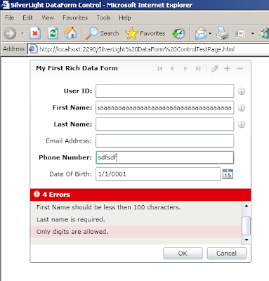
In the image 3 you can see the labels are bold for the field User ID, First Name, Last Name and for Phone number , as I have set the RequiredAttribute of these fields. When you click on the edit or add record button on the top of the dataform, then dataform will validate the required field by showing error summary at the bottom of the form.
3- Description:
In order to set some description of the field. In order to set value for this , again you have to use the description of displayAttribute. You can specify a description for a property. If you'd like to display a field's description, you can use the DescriptionViewer control, which handles this for you automatically. It will display an information glyph that provides a tooltip containing the description of the property it is associated with. Below is the Image which will show the Description view for the fields for which I have set the description.
4- Validation:
In order to do validation for the user inputs. You can sue the StringLength and regularExpression etc to validate user input and restrict user input.Below is the code which is using these two attribute. For stringLength you need to give the maximum length user can entered in the input filed and also the ErrorMessage which is shown when user click the save button.
[Display(Name="First Name:", Description="First Name is Required.",Order=2)]
[StringLength(100,ErrorMessage="First Name should be less then 100 characters.")]
[Required (ErrorMessage ="First name is required.")]
public string FirstName { get; set; }

[Display(Name="Phone Number:")]
[Required(ErrorMessage = "Phone number is required.")]
[RegularExpression(@"^\d*",ErrorMessage="Only digits are allowed.")]
public string ContactNumber { get; set; }
You can see the output in the Image 5 where message summary is shown to display the errors when user click the save button .
Moreover you can set a field to readonly by using the Bindable attributes which take the boolean value to indicate whether property is bindable or not true mean bindable and false mean not bindable and field will not be shown in the dataform. And second parameter is BindingDirection enum which is either OneWay or TwoWay. OneWay mean you can read the value but can't change but in twoWay case you can change the value of the the property on dataform.You can explorer more about dataform control, this is the starting point about the dataform control, hope you get initial starting point about the dataform control.You can download the source code from here
All and any comments / bugs / suggestions are welcomed!


No comments:
Post a Comment