Monday, September 27, 2010

Changing Background Color Of DataGrid Cell WPF 4

In this short post I will show you how to change the background color of the column of the data grid control depending on the binding value.Let us start with the code what code or technique you need to change the background color of the column of the data grid control.The output of the example code can be see in Image 1. Here you can see that I have set background of the column to green and red which has values 80 and 90 respectively. Now I will explain you the code which is used to set the background of the column.


Image 1
In the List 1 you can see the xaml code which is used to set the background color of the column of the data grid control, depending on the value of the binding property.Here you can see that I have used the DataGridTemplateColumn and set the header and the sortMemberPath ( used to sort the column, if not given you can't sort the DataGridTemplateColumn). And then I have used the CellTemplate to define the DataTemplate of the column. As I have only one property to be bind in this column so I have place border control and then inside the border control I have place the text block control and bind the text property of the text block control.

 <DataGridTemplateColumn Header="Total Sale in %" SortMemberPath="Sales"> <DataGridTemplateColumn.CellTemplate> <DataTemplate > <Border x:Name="brdBroder" VerticalAlignment="Stretch" Margin="1"> <TextBlock Text="{Binding Sales}" Margin="3,1" x:Name="txtTextBlock"/> </Border> <DataTemplate.Triggers> <DataTrigger Binding="{Binding Sales}" Value="80"> <Setter TargetName="brdBroder" Property="Background" Value="Green"/> <Setter TargetName="txtTextBlock" Property="Foreground" Value="White"/> </DataTrigger> <DataTrigger Binding="{Binding Sales}" Value="90"> <Setter TargetName="brdBroder" Property="Background" Value="Red"/> <Setter TargetName="txtTextBlock" Property="Foreground" Value="White"/> </DataTrigger> </DataTemplate.Triggers> </DataTemplate> </DataGridTemplateColumn.CellTemplate> </DataGridTemplateColumn>
List 1

Next is to define the trigger which are used to change the background color of the border which is placed in the Data Template. Here I have used the DataTrigger, which will used to check the value of 80 and 90 and set the background color of the border control to the green and red respectively as you can see in the Image 1 which is shown at the start of the post.You can download the source code from here.

All and any comments / bugs / suggestions are welcomed!


Sunday, September 26, 2010

Displaying RowNumber in datagrid control

In this post I will show you how you can display row number in datagrid control using IMultiValueConverter.Let us start with the code.The code shown in the List 1 is used to bind using the IMultiValueConverter and the passing parameter for the binding converter are the binding and parent datagrid control

< DataGridTextColumn Header="Row Number" IsReadOnly="True"> < DataGridTextColumn.Binding> < MultiBinding Converter="{StaticResource rowNumberConverter}"> < Binding /> < Binding RelativeSource="{RelativeSource FindAncestor, AncestorType={x:Type DataGrid}}" /> < /MultiBinding> < /DataGridTextColumn.Binding> < /DataGridTextColumn>
List 1
Now in the converter I have simple code to show the row number of the current element which is passed to the converter in first parameter. I have store it in the object type variable. As I don't know what is the type of the first parameter and then I created another parameter of type data grid control and save the second parameter in it. Now in the next statement I have get the Index of the passed parameter in the data grid control and also added 1 in it, as IndexOf will return 0 for the first element. You can see the code in List 2.

public object Convert(object[] values, Type targetType, object parameter, System.Globalization.CultureInfo culture)  {   Object item = values[0];  DataGrid grdPassedGrid = values[1] as DataGrid; int intRowNumber = grdPassedGrid.Items.IndexOf(item) + 1; return intRowNumber.ToString().PadLeft(2, '0');  }
List 2

And you can see the Row Number column in the Image 1, I have set the header text of the column to "Row Number", You can changed it to you requirements.
Image 1

In the Image 1 you can see that I have used the left padding for the row number, as you can see that each row number is padded left by 0 I have used it to 2 values, You can also pass the length of your padding in the parameter of the IMultiValueConverter. You can download the source code from here.

All and any comments / bugs / suggestions are welcomed!


Sunday, September 12, 2010

Reflection Effect For Beginners Using Silverlight 4

In this post I will show you how you can create the Reflection effect using the blend 4 in Silverlight application. It is really easy and nice to have the reflection effect in your application.Creating reflection and mirror effects is a little different than creating blur and shadow effects because these effects are not built into Silverlight. However, you can create reflection and mirror effects by using features present in Silverlight. Output of the this exercise will be as shown in the Image 1.

Image 1

Let us start the example and how to create reflection effect in Blend 4.Create a silverlight application using blend 4. In the MainPage add text block control and set text property of the text block control. I have set the "REFLECTION EFFECT" in my case, you can set what ever you like. And also set the foreground color of the text and the properties which you want to set like font size, font family etc.

In the next step copy past the text block you have created previously and set the scale of the second text block control. In the image 2 you can see that I have set the scale of the second text block control to -1 for the y-Axes. By setting the second text block scale to -1 the second text block will flip. Now set the margin of the second text block so that it can placed beneath the first text block control (As I have placed my both text block control in grid layout so you need to set the margin from the top of the second text block control.
Image 2
The next step is to set the foreground color of the second text block control to that it will look like the reflection of the first control. Select the foreground color of the second text block control and set the gradient color of the foreground color.

Image 3
Now reverse the gradient color and set the opacity of the first color to 0 percent and the offset of the first color will be 0.255. By doing so it will create reflection like effect.

All and any comments / bugs / suggestions are welcomed!


Drop Shadow Effects For Beginners

It is very easy to create drop shadow in the expression blend. In this post I will show you how you can use the expression blend 4 to create the drop shadow of the object.DropShadowEffect is a pixel shader effect that applies a shadow behind an object. The shadow is positioned at a specified distance from the object and at a specified angle.The output of this exercise will be as shown in the Image 1.

Image 1
Now let us start our example of how to create drop down effect.Create new project in expression blend 4. I have created silverlight application in expression blend 4.I have inserted the text block control and set the text proper of the text block to "DROP SHADOW EFFECTS". Now next step is to create the drop show for the text block.

Image 2
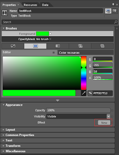
Now click on the new button in the Effect which is located in the Appearance(you can see it in Image 2.and is a red rectangle is placed around the new button.). You will see new dialog box which is shown in the Image 3. From here you can see there are two effect Blur and the DropShadow effect. As we are creating drop shadow effect so select the DropShadow effect from the list and press OK.

Image 3
When you click on the OK button following properties for the Drop shadow are appears blur radius, color, Direction, opacity and shadow Depth property.


Image 4
Here is the detail of the drop shadow effect properties

Blur Radius :
              The BlurRadius property blurs the shadow in a similar manner as BlurEffect.

Color :
              The Color property specifies the color of the shadow
            
Direction :
              The Direction property sets the angle at which the shadow is cast. The valid range of values is from 0 to 360. A value of 0 places the shadow directly to the right of the object. Increasing the value causes the shadow to rotate counter-clockwise around the object. So, directly up from the object is 90. The default value is 315.

Opacity :
             The Opacity property specifies the opacity of the shadow. A value of 0 indicates that the shadow is completely transparent and a value of 1 indicates the shadow is completely opaque.

Shadow Depth :
             The ShadowDepth property sets the distance between the object and the shadow that is cast. Increasing this value positions the shadow effect further away from the object. The default value is 5

All and any comments / bugs / suggestions are welcomed!


Friday, September 10, 2010

Binding DataGrid RowDetailTemplate Using MVVM

In this post I will show you how you can bind the RowDetailTemplate of the data grid using the MVVM pattern. Below are the image of the sample code here you can see the default page in Image 1 and when user click on any of the record then detail of the record is shown in the RowDetailTemplate which also consist of the data grid control which you can see in the Image 2.

Image 1
Here in the Image 2 you can see the RowDetailTemplate of the selected record. Here you can see the user id , programming language and the Expert Level ( Column names which are displayed in the inner data grid control).

Image 2

Let us start with the sample code. I will explain model first , then the view model and at the end the view.

1- Model:
               In the model I have two classes one is the Persons and second is the PersonDetail. The Persons class consist of the user id, first name, last name, email id , contact number and date of birth properties. The Persons class will be used to show records in the main data grid, which you can say the outer grid. The Persons class has only one function which is GetPersonRecord which is used to return the list of Persons records and the function is static so just call the GetPersonRecord function by using the class name.The PersonDetail class consist of three properties which are user id, programming language and the Expert Level. The PersonDetail class will be used to show records in the RowDetailTemplate ( Which consist of one data grid control to show the Person expertise in programming language). The PersonDetail also have one static function which will return list of PersonDetail records.

2- View Model : 
            The view model only consist of one class MainWindowViewModel. This class will be used to bind with the MainWidnow view. The MainWidnowViewModel is inherit from the INotifyPropertyChanged interface.The INotifyPropertyChanged interface is used to notify clients, typically binding clients, that a property value has changed. The ChangedProperty event of  INotifyPropertyChanged is implemented. The view model also consist of three properties one is used to bind the outer data grid control and second is used to bind selected value and third one is used to the bind the inner data grid which is used to bind the RowDetailTemplate data grid control.PersonRecords is the property which is used to bind the outer or main data grid control, as I need to bind the data grid control for just display of records so I will not raise RaisePropertyChanged event for this property as only one time binding is required in this case. PersonRecords property will get/set the list of Persons records and It will be initialized on the constructor of view model class.Second property is SelectedRecord which is used to bind with the outer/ main data grid selectedItem property. As I have to filter the record for the RowDetailTemplate data grid control. When the value of the SelectedRecord property will be changed then I have raised the RaisePropertyChanged event as I will filter the details record based on the current selected record in the outer/main data grid control.Below is my code which is used to filter record in the RaisedPropertyChanged function. As the PersonDetail.getPersonDetail() will return the list of PersonDetail, So by using the LINQ technique I have filter record based on the SelectedRecord user id.

if ("SelectedRecord" == pstrPropertyName) SelectedPersonDetail = PersonDetail.getPersonDetail().Where(param => param.UserID == SelectedRecord.UserID).ToList();

The last and the important property in the view model is the SelectedPersonDetail property, which is used to bind with the RowDetailTemplate property. As the SelectedPersonDetail property will changed every time user click on the row in the outer/main data grid control so RaisePropertyChanged event will be fired every time the value of the SelectedPersonDetail property will changed.

3- View :
         The view is very simple one here the outer/main data grid Item source and SelectedItem properties are set. The imported property which is used to bind the Item source of the RowDetailTemplate data grid is listed below, I have only write the xaml of the Item source of the data grid control.

ItemsSource="{Binding Path=DataContext.SelectedPersonDetail , RelativeSource={RelativeSource AncestorType=Window}, Mode=OneWay}"

In the above xaml code you can see that I have used RelativeSource to bind the Item source of the RowDetailTemplate data grid control. The RelativeSource property is used to specify as a source an object that is positioned relatively to the current object. Once again, this property is used when there is a need to specify a source other than the DataContext of the object.FindAncestor mode allows the retrieval of an ancestor of the current object based on its type. I have specify type to be window as I want to bind the DataContext property SelectedPersonDetail which will be the filtered records of the selected persons records.You can download the source code from here.

All and any comments / bugs / suggestions are welcomed!